
Please note: this case study is in the process of being updated
·
Please note: this case study is in the process of being updated ·
Bean & Blend Coffee Co.
Service (s)
Logo & visual identity design
Year
2023/2024
Awards


After finding inspiration working in a coffee trailer together, Lily and Raamie saw the huge potential portable coffee trailers can have. By introducing a more customer-focussed approach and serving a bunch of delicious homemade drinks and snacks under their own brand, they could leave their current jobs in pursuit of starting a business legacy that could be passed down through the generations. This would be no easy task as this is a very saturated market with minimal product offering differentiation so Lily and Raamie needed a strong brand to really make inroads.

The concept
The wonderful challenge that comes with working on brands such as coffee shops is there is little iconic imagery to play with that hasn’t been overused and become cliché, e.g. coffee beans, coffee cups, steam, etc. Unearthing some visual language that can truly represent the brand outside of these expected routes is essential.
Thankfully Lily & Raamie came with a very clear idea for how they wanted their brand to feel which was half of the challenge. Positive, quirky, bold, unique and eye-catching. They also mentioned their interest in creating a mascot who could really exemplify these traits.
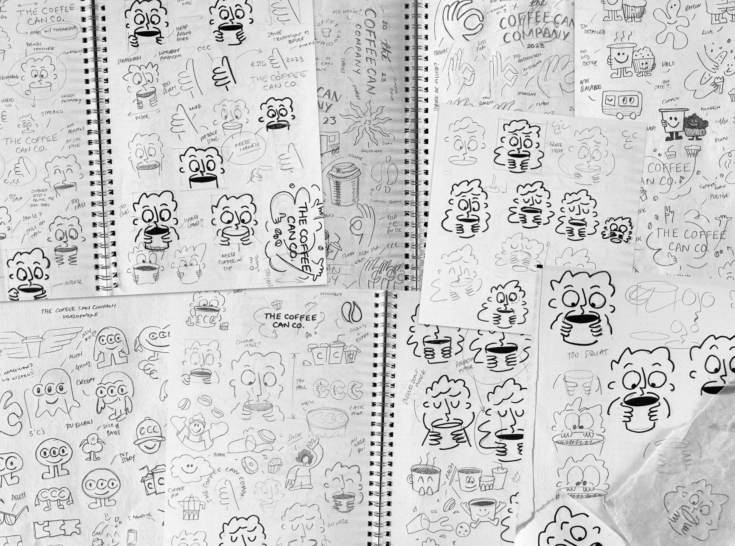
After conducting my research and aligning on a design direction with Lily & Raamie, I set to finding an illustration style that could convey the aforementioned qualities and also ticked the box of rustic modernism (basically impossible right?). WRONG. I soon fell in love with a rough and ready approach nailed by the likes of Harry Wright (harrysdesigns.com) which felt authentic and honest but paired with some high saturation, punchy colours could feel quite modern and edgy.
I often struggle with more illustrative logo designs because I never know when it’s finished. I could easily spend hours and days tweaking and tuning corners having little to no effect on the overall design. This was no different here as you can see from the million different sketches I did. But we got there in the end!

Type & colour
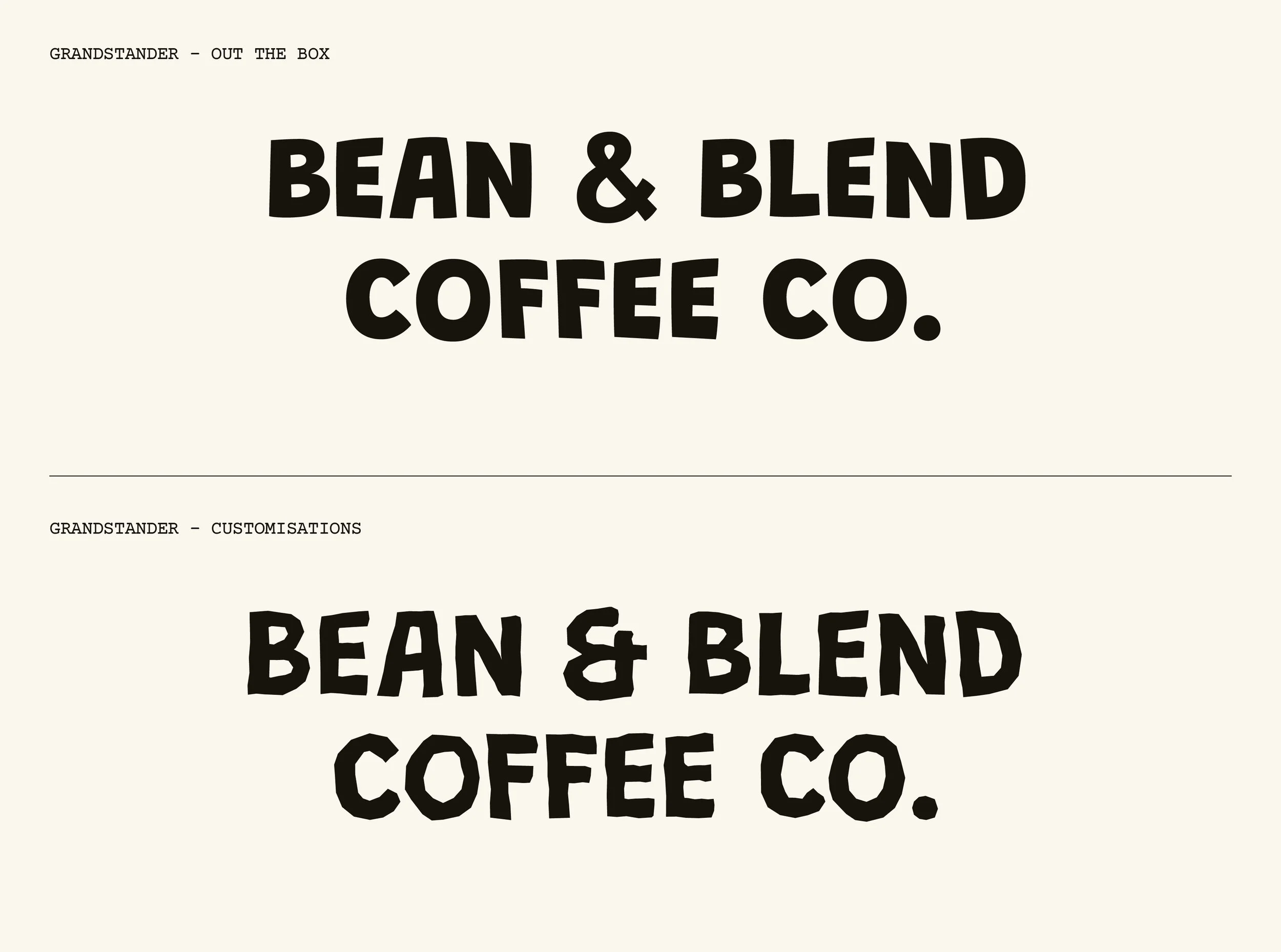
With the little character bringing so much personality to the table, we needed to match that energy with the rest of the identity. Starting with the typography, I found a wicked typeface called Grandstander which felt fun, laidback yet confident. After some tweaks and redrawing the ampersand based on the shapes found in the B letterform, we got to a really good place.
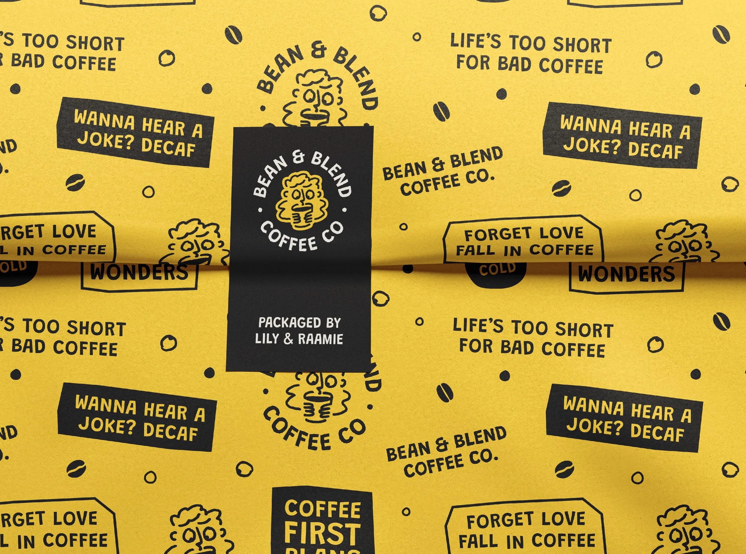
Next up was the colour palette. I can’t take full credit here as Lily & Raamie came with some fantastic suggestions based on the wealth of industry knowledge they brought to the table. We knew yellow was going to play a part from the get-go but I needed to find the right hue and let it really sing with the rest of the colour palette. I think we nailed it!
With the core elements of the identity finalised, I got to blow it out into some other assets. One of my favourites being this beauty of a pattern. It combines some classic coffee quotes, imagery and other logo variations to create a truly unique, impactful and eye-catching brand asset. Stoked with how it came out.


Testimonial
I had so much fun working with Lily & Raamie on this, I got to experiment with a different style and I think as a team, we really did the brand justice! Here’s some lovely words from them:
“It has been amazing working with Jack. He absolutely brought the vision for our brand to life. We were unbelievably thrilled when we saw the brand identity he created for Bean & Blend. Throughout every step in the process he listened to our requirements thoroughly which was reflected in the end result. He produced a brand identity and logo which was exactly what we were looking for. It was clear that he carefully assessed our brief and moodboard to gain a full understanding of our vision. He maintained transparency throughout which also enabled us to be honest and open with all our thoughts and ideas. His presentations were extremely thorough, professional and clear which made it very easy for us as clients to follow and understand. We will continue to work with Jack throughout our new business journey. We cannot recommend him enough!!”