
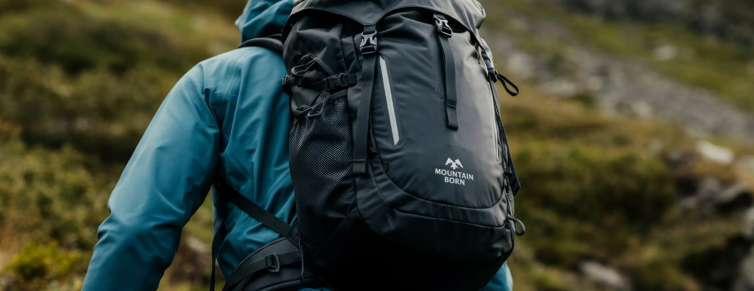
Mountainborn
SERVICES:VISUAL IDENTITY DESIGNINDUSTRY:OUTDOOR & LIFESTYLE GOODSYEAR:2025Mountainborn is an independent gear brand rooted in the belief that form follows function. Based in Japan, the brand focuses on creating purposeful carry goods designed for adventure, hiking, and everyday movement. With an emphasis on reliability, craftsmanship, and performance, Mountainborn avoids unnecessary decoration in favour of thoughtful, resilient design built to endure real-world use. This approach is informed by years of in-depth bag reviews, where extensive hands-on testing and long-term use shaped a deep understanding of what truly works in the field.
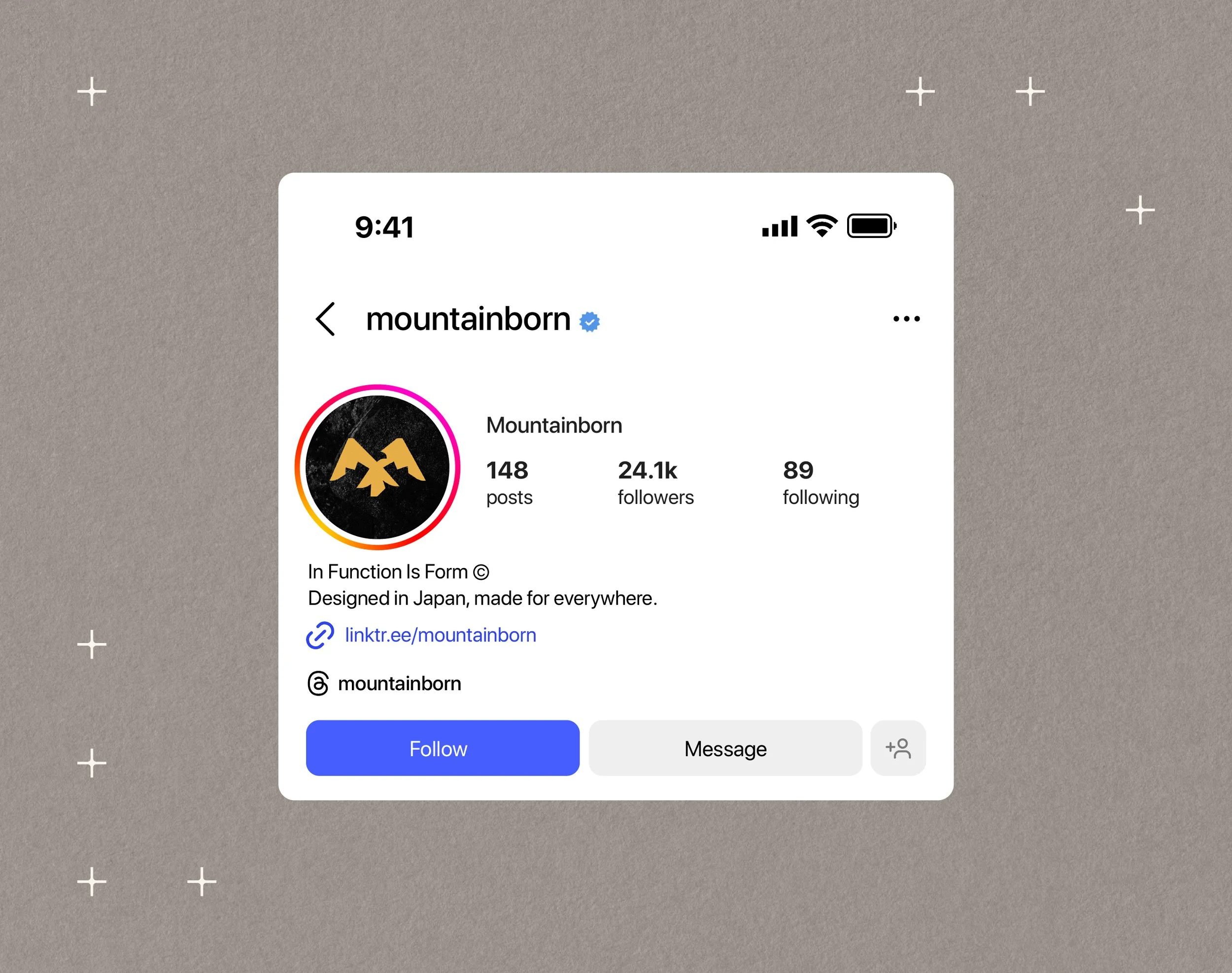
My project with the team at Mountainborn focused on creating a new visual identity; one that clearly reflected its function-first philosophy and commitment to performance-led design. Steering away from the stark minimalism seen in the industry, the identity uses restraint and considered abstraction to communicate reliability, exploration, and authenticity. The result is a distinctive and adaptable system designed to work seamlessly across digital platforms and future physical products.

Finding the balance between simplicity and story within the brand mark provides real-world functionality and the opportunity to connect with people on a deeper level.
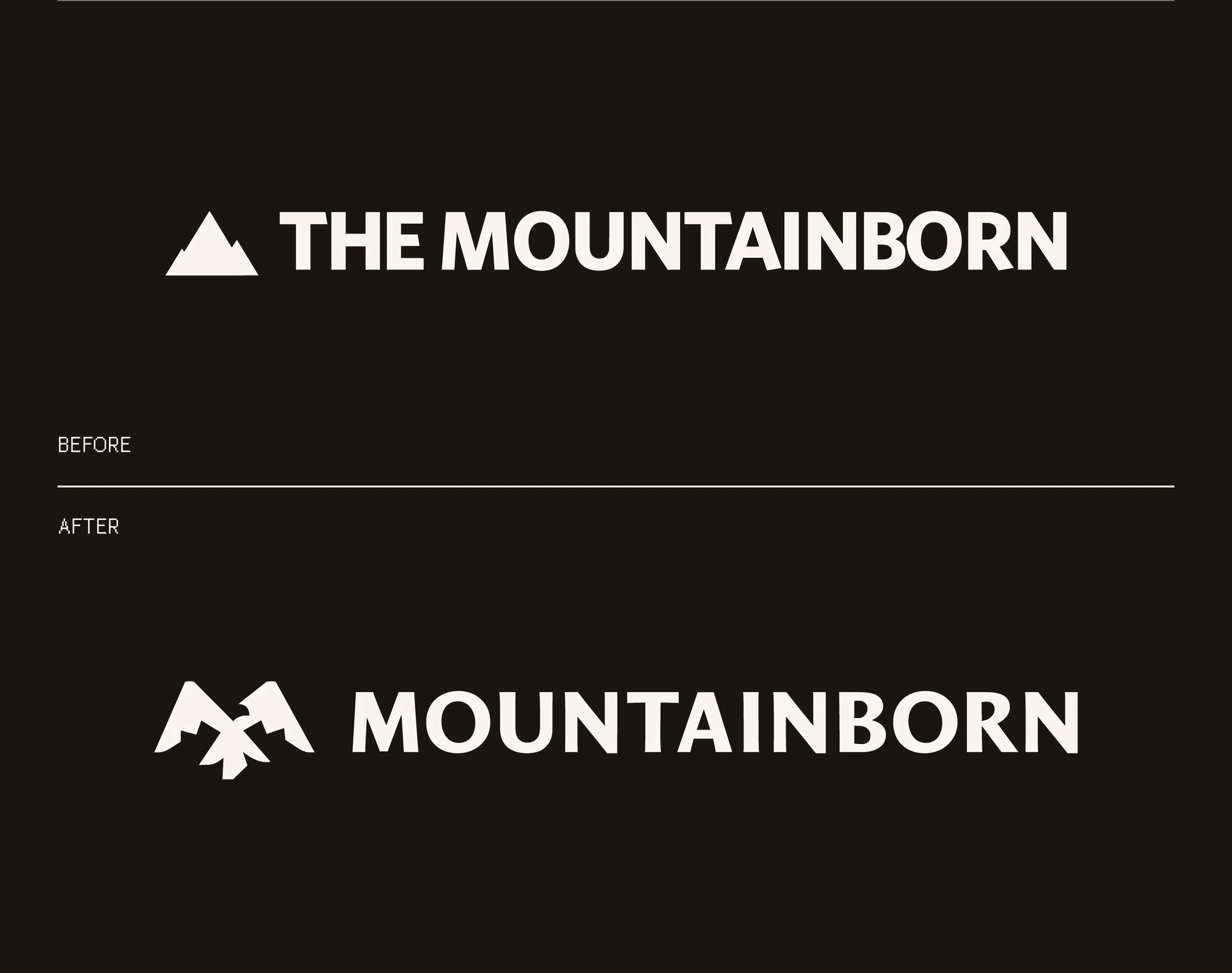
With the ethos of Mountainborn being so aligned with the idea of form following function, their brand was naturally clean, minimal and highly legible but it lacked that special sauce that makes people connect with, and ultimately, remember it. In addition, there were several players in their market that opted for this hyper-minimalist aesthetic so Mountainborn needed something new that would help them stand out whilst still communicating their utilitarian philosophy.
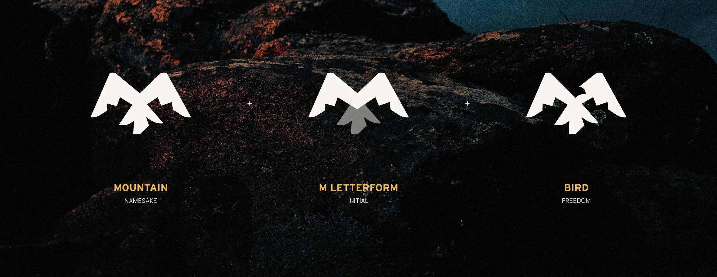
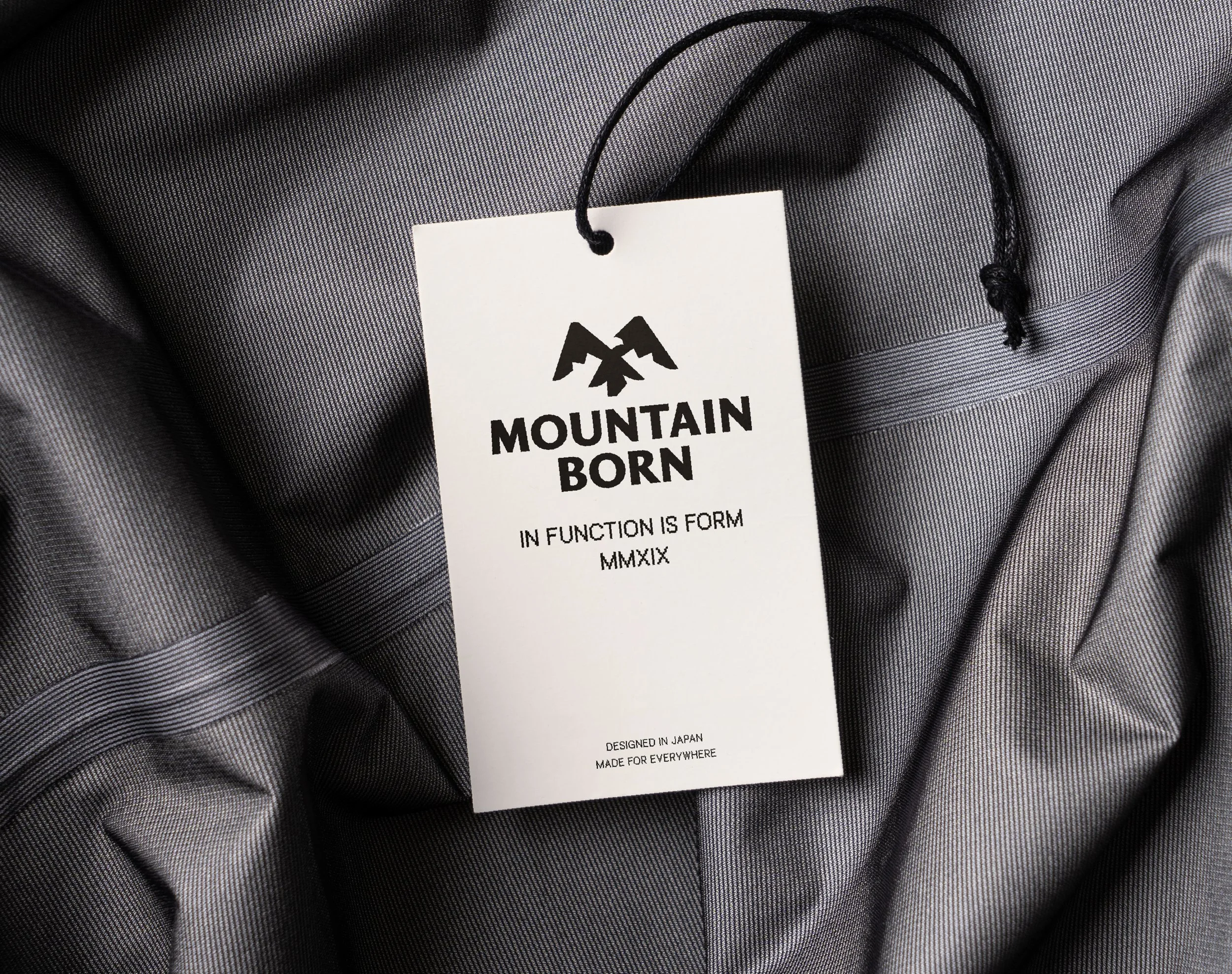
When exploring ideas for the brand mark, mountain peaks felt like a natural starting point. They offered a direct visual link to the name and built upon the existing logo. Pictorial marks like this can be really effective for recall as they connect the logo directly to their brand name - like the Apple logo. When playing around with different executions, I found the shared visual language between a mountain peak and the letter ‘M’ presented an obvious opportunity, but I wanted to push this further.
The word ‘born’ kept pulling me back to the idea of wildlife. What animals are born in the mountains? This led to the idea of a bird, an element that not only connects naturally to high-altitude environments but also embodies freedom, independence, and movement. These qualities align closely with Mountainborn’s values of adventure, exploration, and self-reliance, adding meaning and emotional depth to an otherwise functional symbol.
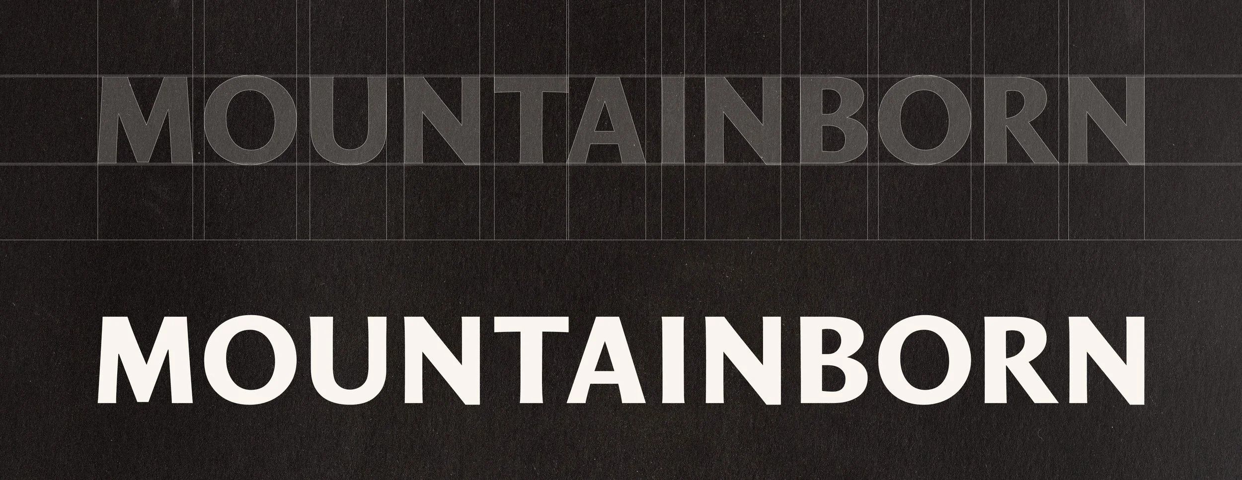
Trying to find a typeface that communicated the quality of Mountainborn’s products whilst feeling modern and innovative was a challenge.
So I built it from scratch.
Every time I design letters, I’m reminded how tricky it can be - especially when trying to achieve a specific vibe. I carefully drew the final wordmark as a semi-serif to sit between the two worlds. On one side, the confidence, heritage, and craftsmanship typically associated with high-end, considered products. On the other, the clarity and restraint expected of a modern, performance-driven brand.
Subtle nods to serif typefaces were introduced to add character and authority without tipping into tradition, while the overall construction remains clean, balanced, and contemporary. Every letter was optically refined to ensure consistency, rhythm, and a sense of quiet confidence, resulting in a wordmark that feels premium without being ornate, modern without being cold, and built to stand the test of time.
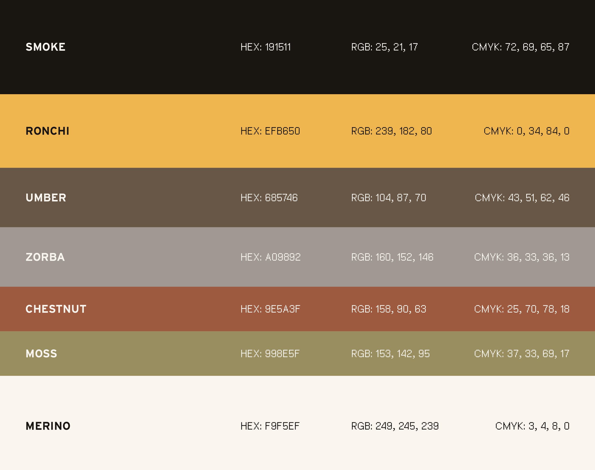
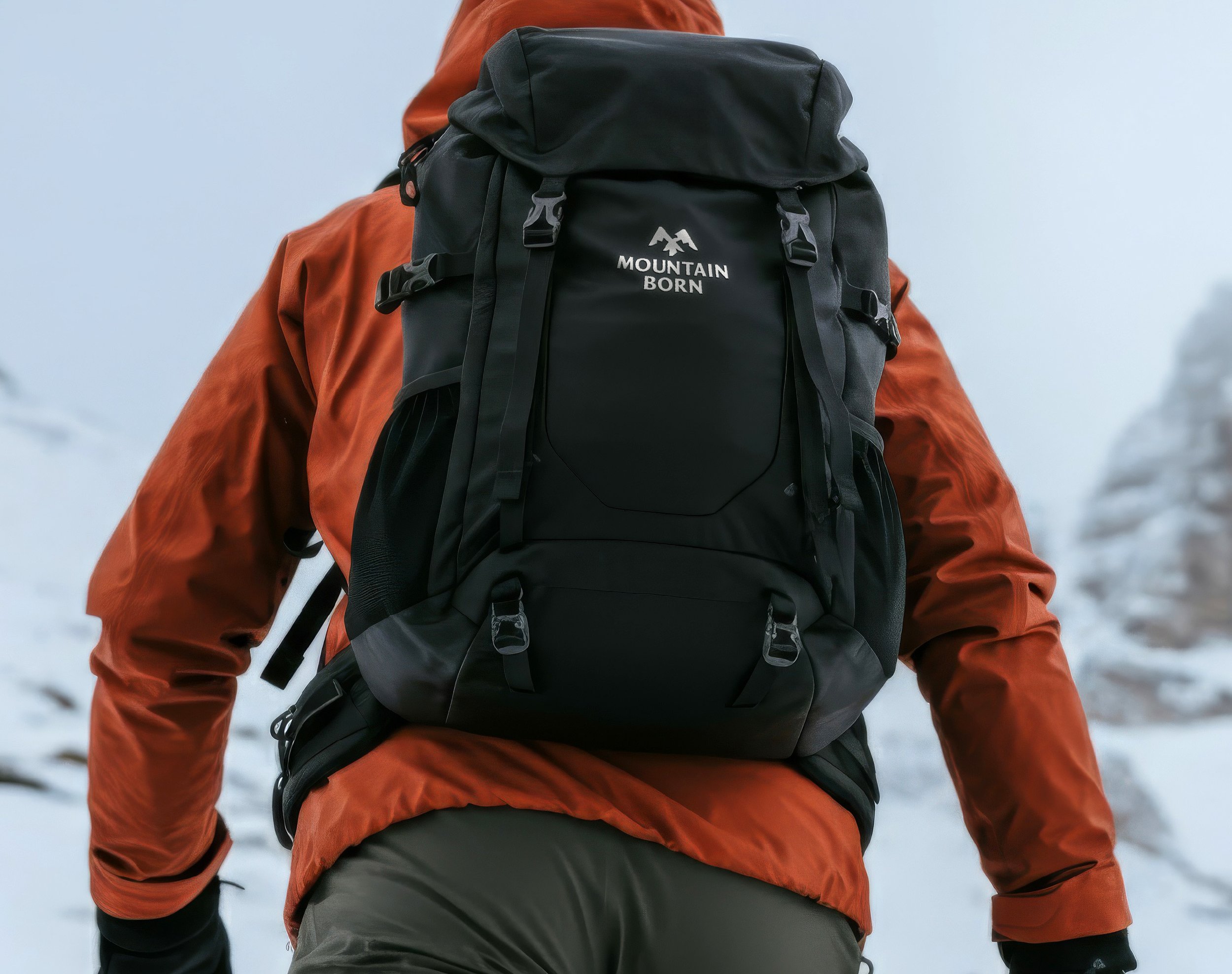
Strategically using colour to differentiate Mountainborn in a predominantly black and white category.
In an industry that largely defaults to stark black-and-white palettes in pursuit of minimalism, Mountainborn’s colour system was designed to create distinction.
A foundation of deep, grounded neutrals provides the same sense of confidence and utility expected within the category, while a range of warmer, natural tones introduces depth, tactility, and personality. The highlight of the colour system is Ronchi - a warm, golden accent used sparingly to draw attention to key moments, details, and interactions. This controlled use of colour allows the brand to feel premium and contemporary, while subtly referencing craft, quality, and the outdoor environments that inspire the products. The result is a palette that feels considered and distinctive, giving Mountainborn a clear visual advantage in a market dominated by monochrome sameness.
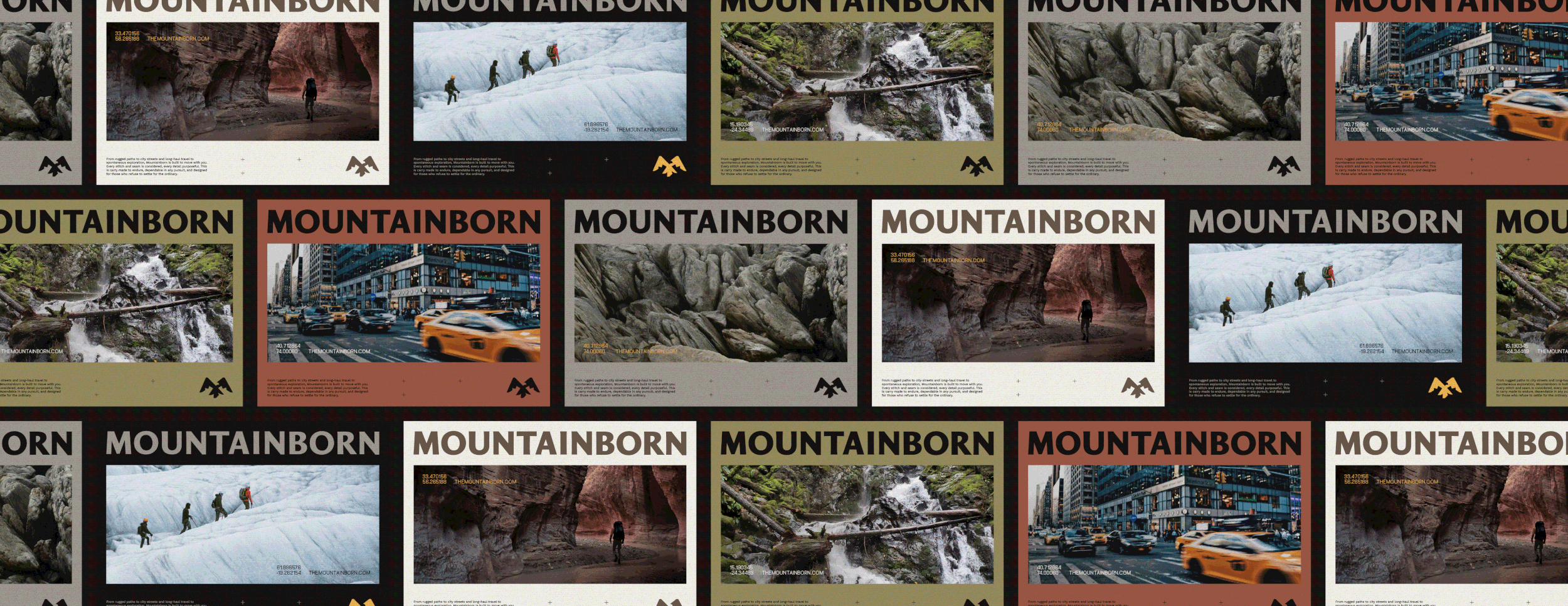
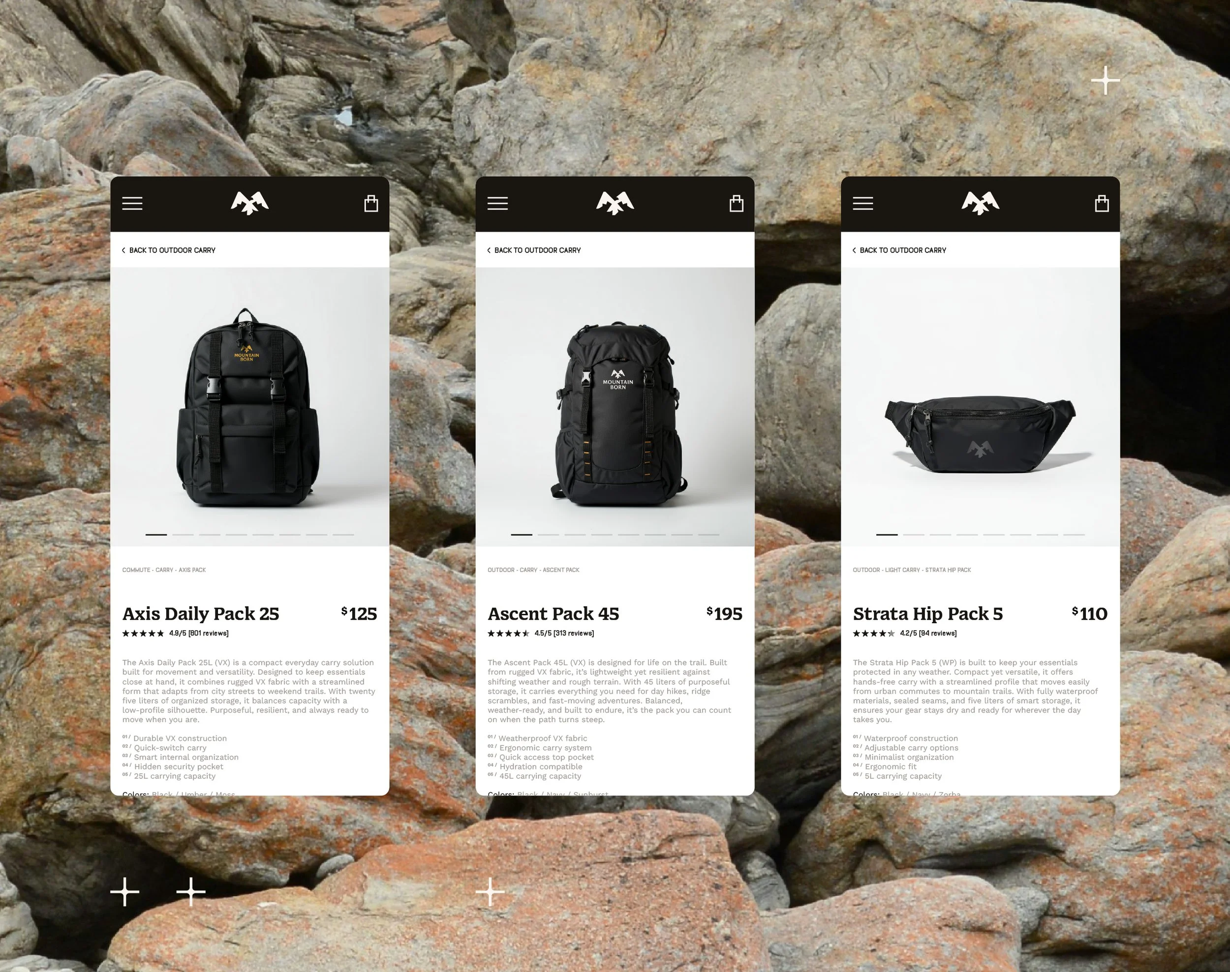
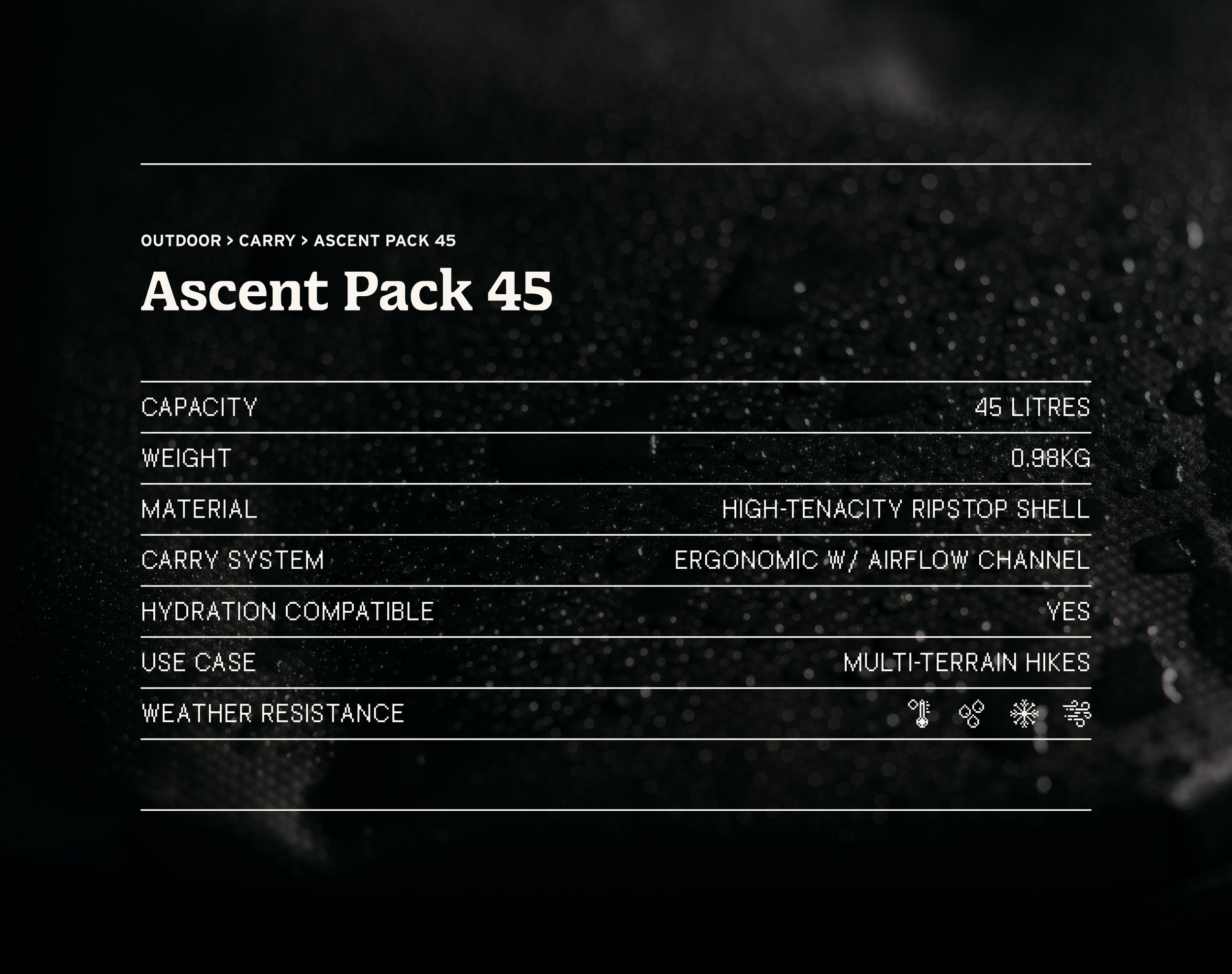
Working in synergy with the brand’s wordmark, is a type system that allows Mountainborn to flex between characterful headings to performance-led copy with ease.
I spent a lot time ensuring the type system was equally adaptable and purposeful as the wordmark. At larger scales, it delivers confident, characterful headings that reinforce Mountainborn’s premium positioning and outdoor credibility.At smaller sizes, it becomes disciplined and highly legible, allowing performance data, specifications, and wayfinding information to be communicated with absolute clarity. This balance ensures the brand can move seamlessly between storytelling and technical detail, whether on digital interfaces, product pages, or physical touchpoints.
This creates a typographic system that feels cohesive and considered, supporting Mountainborn’s ambition to combine design-led brand expression with the demands of functional, performance-driven products.

“I discovered Jack through YouTube and was instantly convinced once I saw his portfolio. Working with him on The Mountainborn logo and brand identity was a wonderful experience. From the very beginning he took the time to understand what not only what I wanted but also what was really needed, guiding the process with clarity, thoughtfulness, and genuine curiosity. He was easy and enjoyable to work with, always responsive and open to exploring ideas together. His work helped refine our thinking and shaped our brand identity into something that truly reflects who we are. I couldn’t be happier with the result and highly recommend him to anyone looking for thoughtful, strategic brand design - thank you Jack!”
Mountain
Founder Mountainborn
Like what you see? Thinking about working together?
Drop me a line here. I’m always up for a chat - especially with people who are passionate about what they do.