
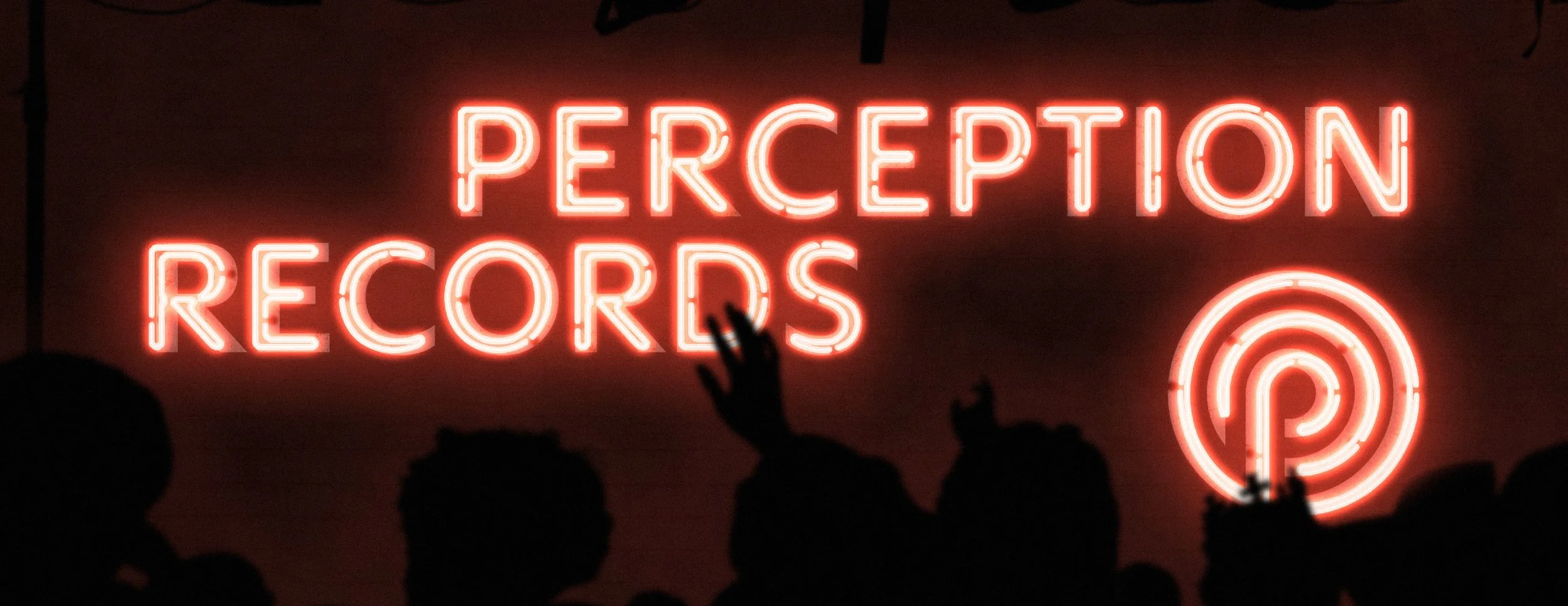
Perception Records
SERVICES:VISUAL IDENTITY DESIGNINDUSTRY:MUSIC & ENTERTAINMENTYEAR:2025Perception Records is an artist-owned record label built to give creatives control over their music, their vision, and their future. Operating across music production, publishing, distribution, and creative direction, the label provides artists with the infrastructure of a major label while maintaining the independence and transparency of an artist-first model.
My work with Perception focused on elevating the existing visual identity rather than replacing it. The goal was to refine what was already working, improve execution and functionality, and ensure the brand could flex quietly across a wide range of artist campaigns without competing for attention. The focus was on clarity, restraint, and adaptability, ensuring the brand could operate confidently across a wide range of artist-led projects while remaining true to Perception’s values of ownership, independence, and integrity.
A conceptually strong mark that already carried meaning, but needed refinement to perform consistently across real-world application.
Perception Records had already built a solid brand and a growing audience over a number of years. Starting from scratch would have meant discarding all that hard-earned brand equity - which is basically gold dust in branding. Instead, the approach was to refine what already existed.
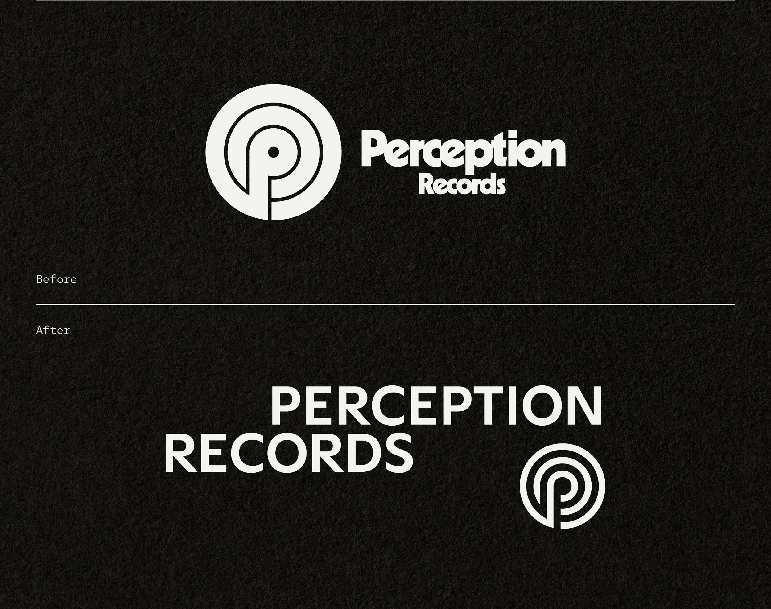
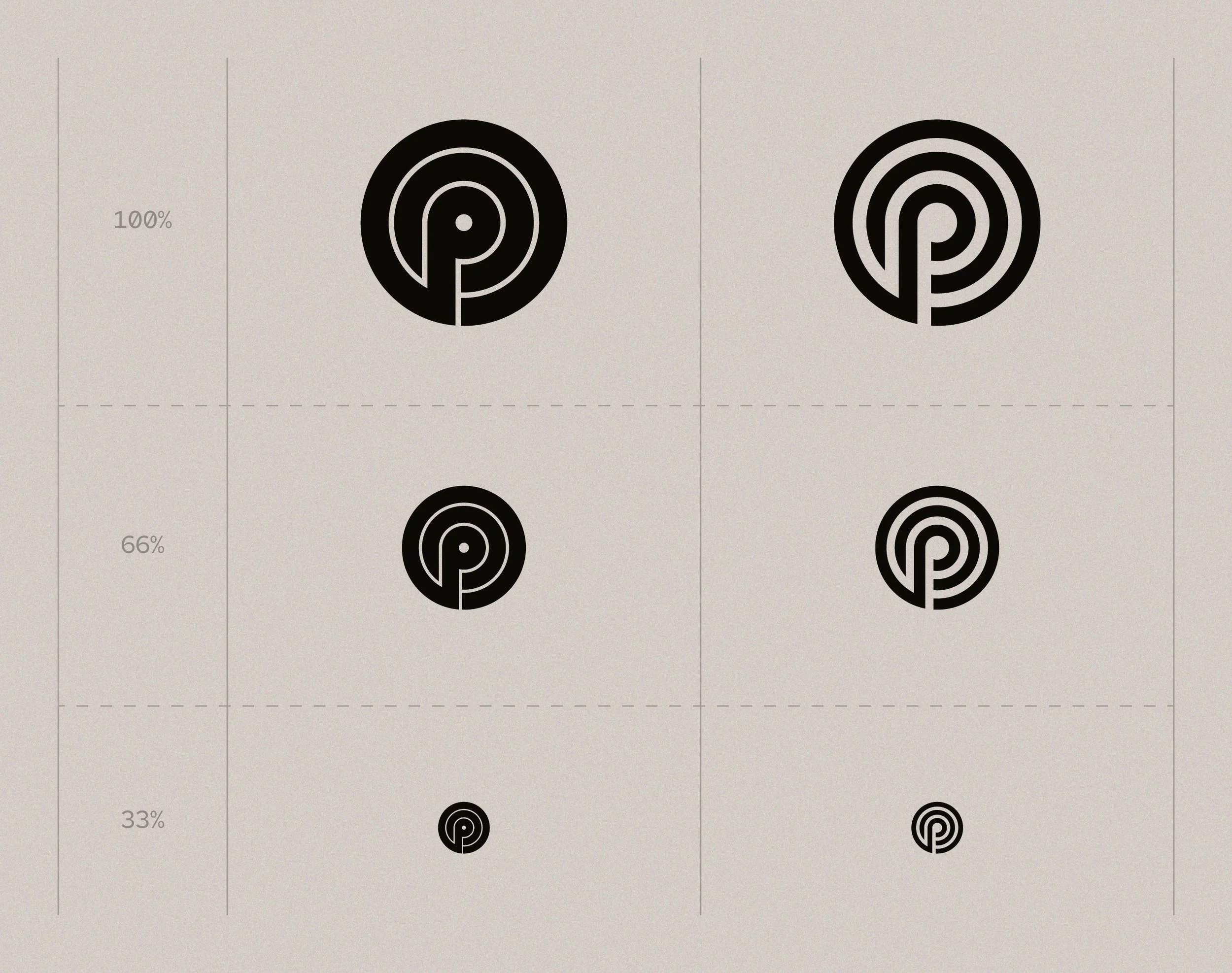
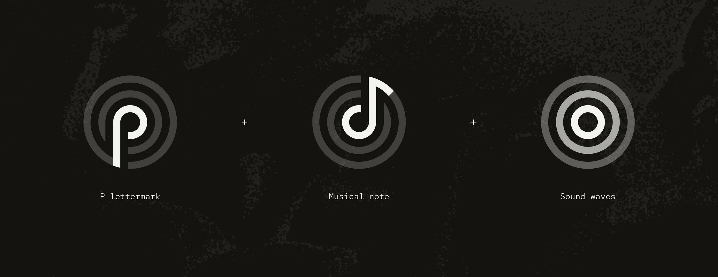
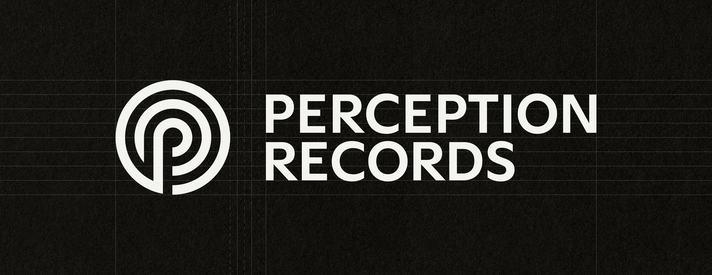
The brand mark itself was simple, clean, and conceptually strong, but struggled with scalability and consistency. By adjusting the weight, increasing negative space, and introducing a subtle cut into the ‘P’, the mark became more legible at smaller sizes and spoke the same design language throughout. These refinements also made the logo significantly easier to reproduce across physical applications and varied printing methods.


Creating a typographic system that could express Perception’s values with restraint, without ever competing with the artists it supports.
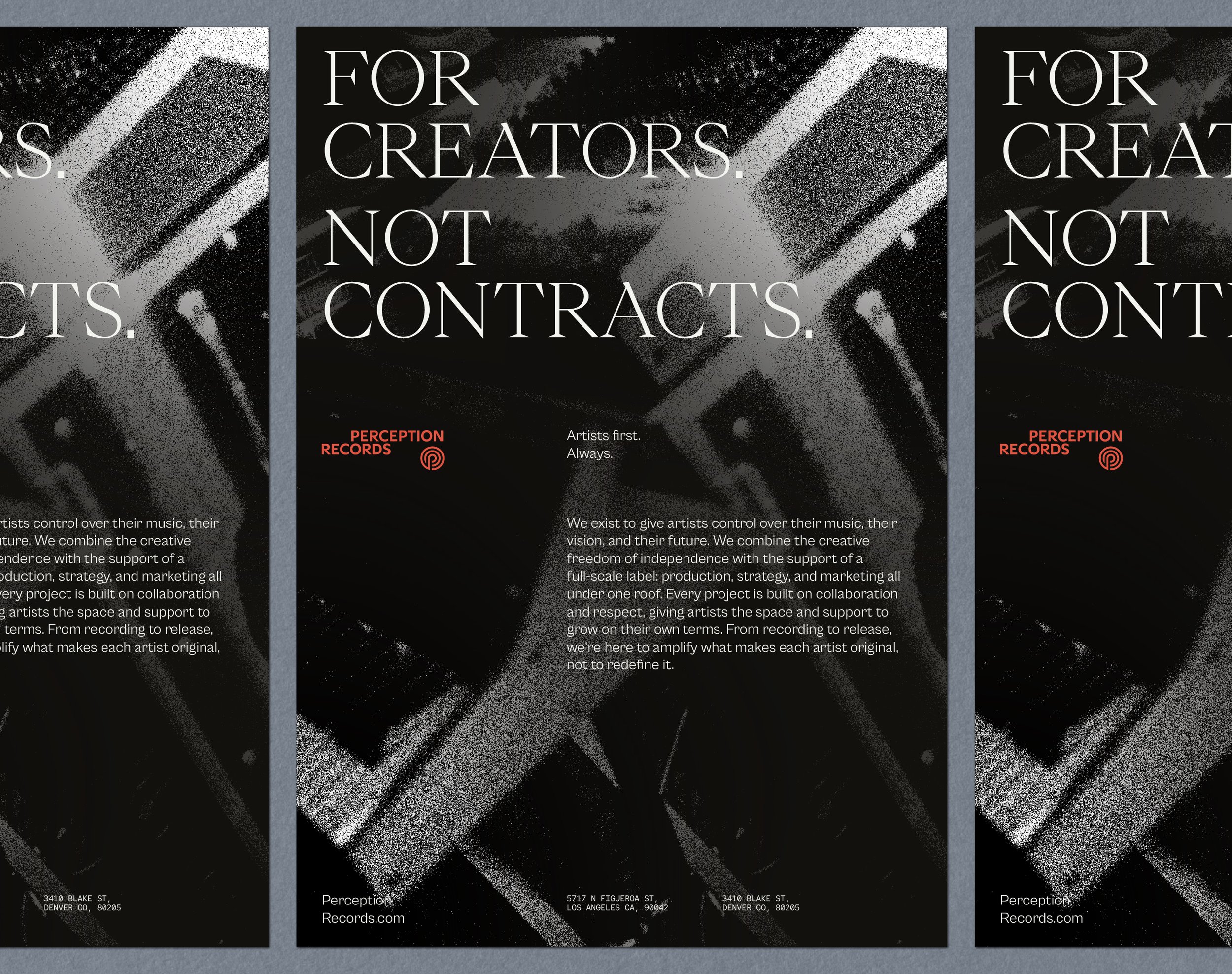
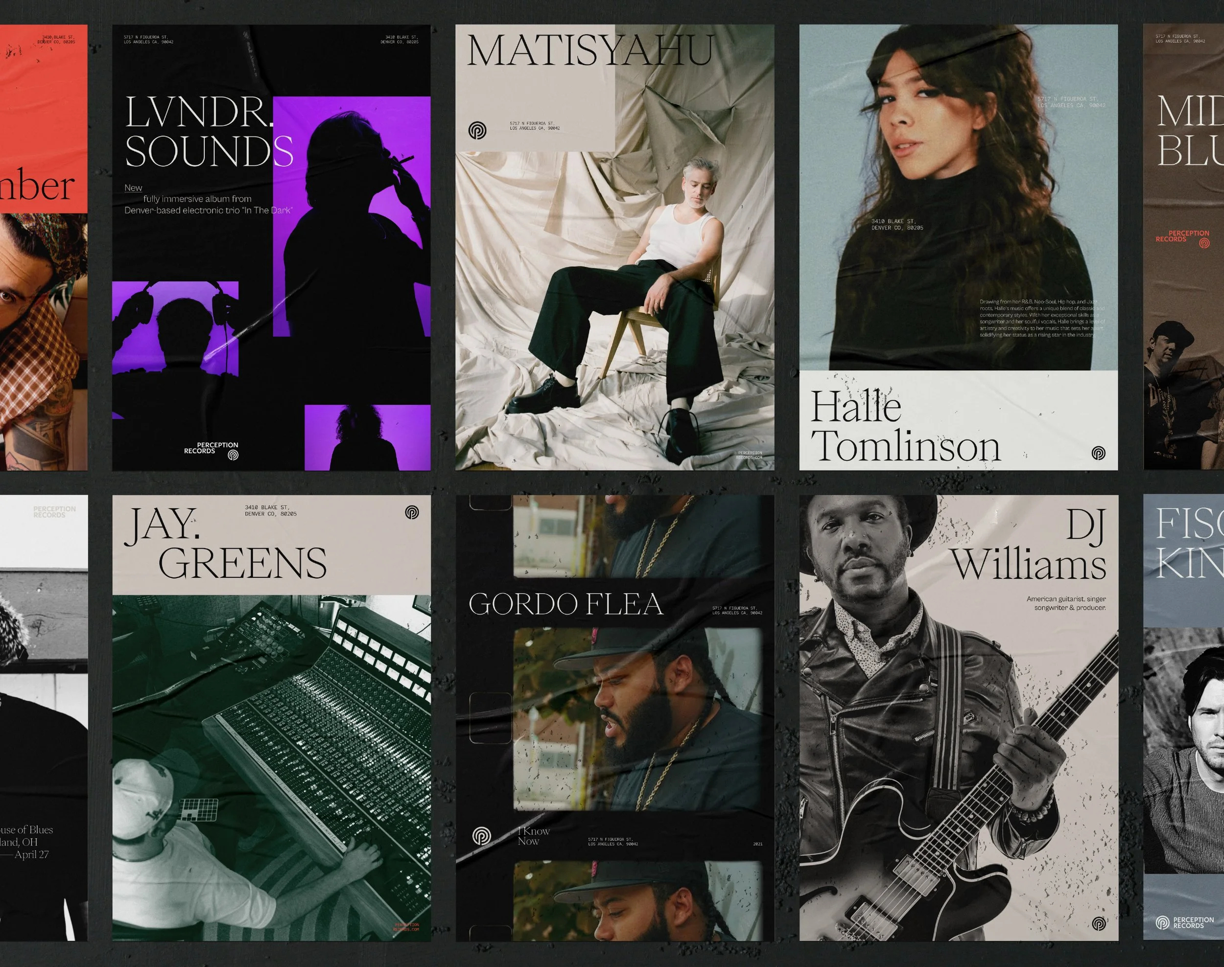
The next area of focus was the wordmark and brand typography. The existing design leaned heavily into an 80s aesthetic. While visually distinctive, this risked communicating a narrower creative focus than the label actually supports.
To address this, I designed a more refined and neutral typographic approach, supported by small custom details and flexible lockups. This allowed the brand to carry personality without dominating the identities of the artists it represents.
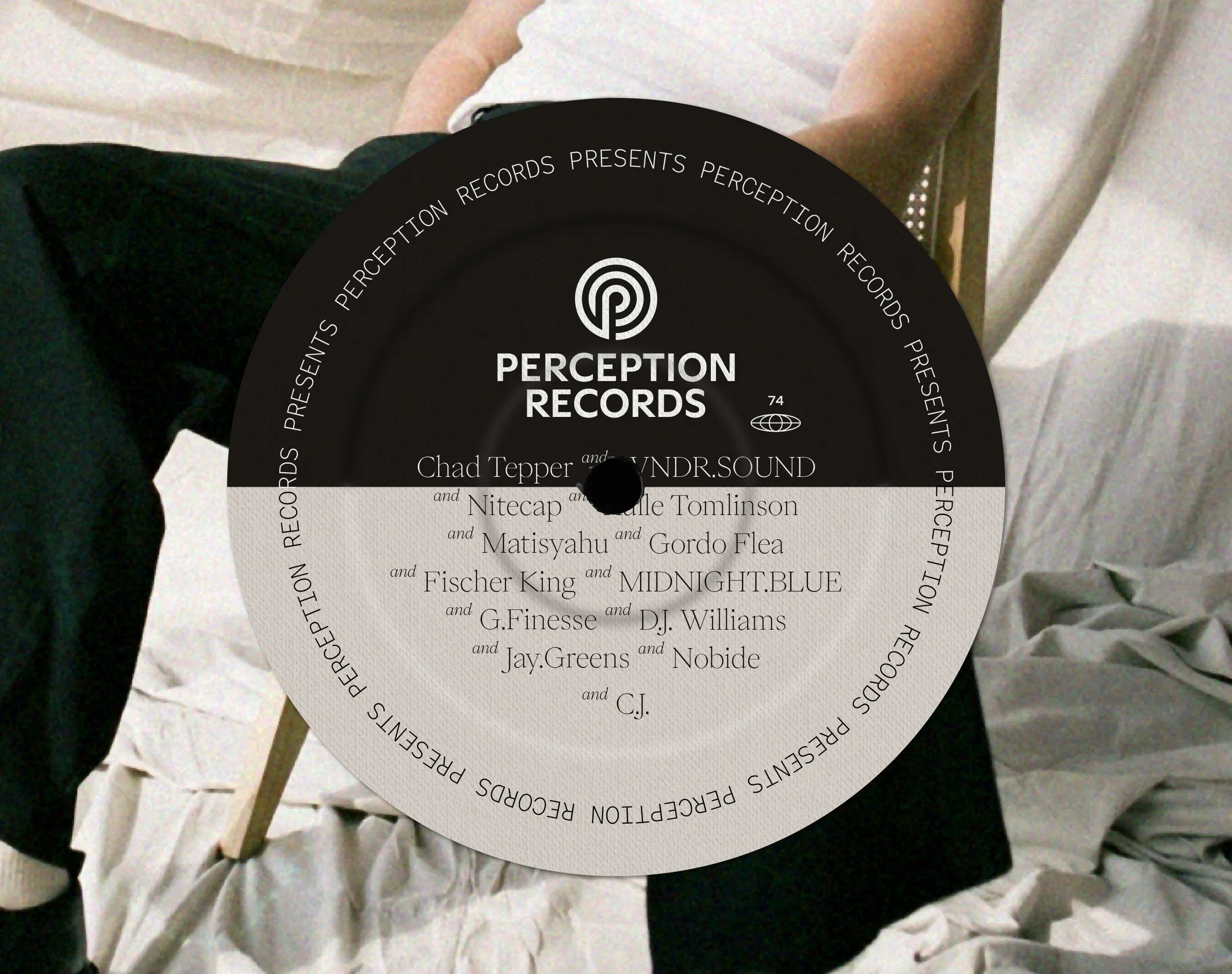
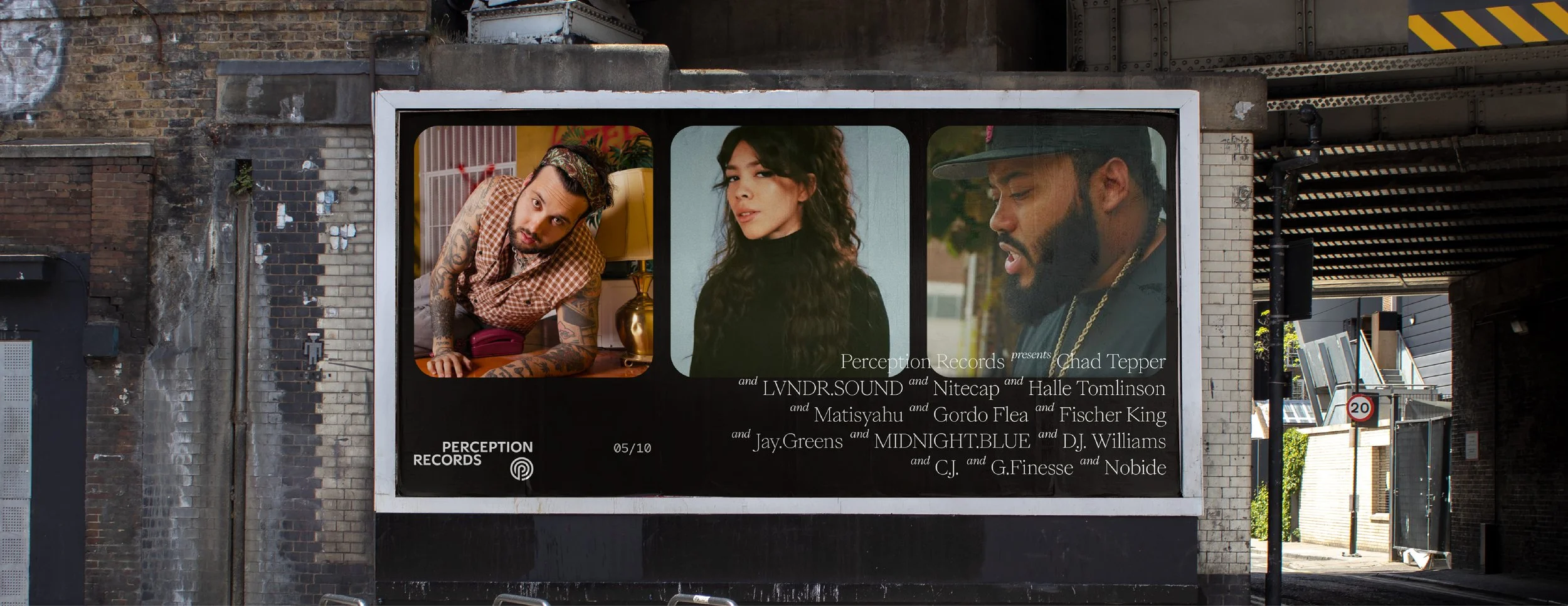
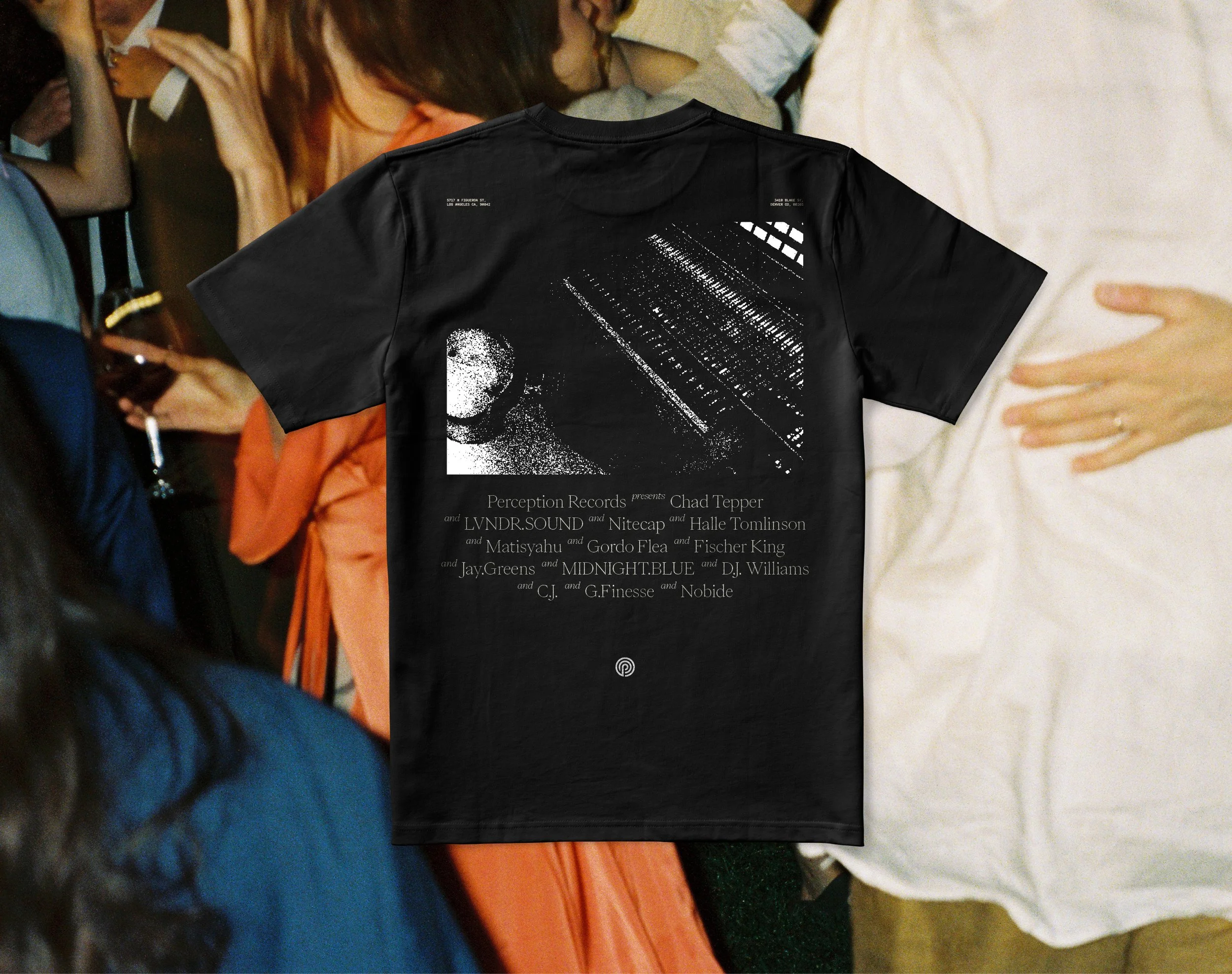
A key part of the brief was ensuring the brand would never compete with the talent on Perception’s roster. The identity needed presence, but restraint. Almost invisible unless you were specifically looking for it. Typography became the connective tissue between all brand assets, quietly communicating the label’s identity while flexing seamlessly across co-branded releases, without losing sight of what Perception stands for.

Applying the same thinking to colour by building a palette with restrained presence, designed to be felt rather than immediately noticed.
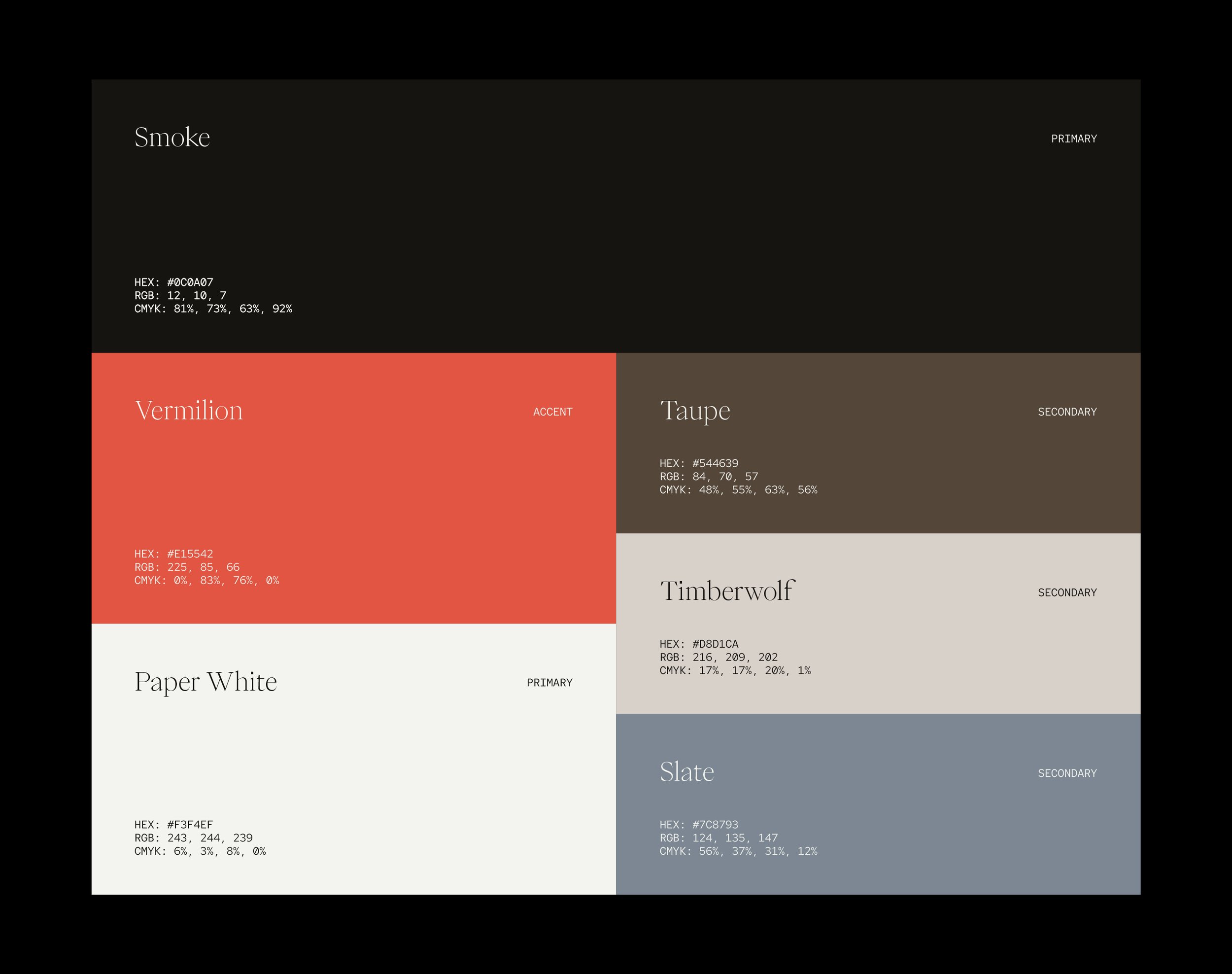
The approach to colour followed the same philosophy as the rest of the identity. It needed enough presence to feel intentional, but enough restraint to avoid overpowering the artists it would sit alongside. Rather than relying on an expansive set of saturated digital-first colours, the palette was designed to feel considered and timeless.
Over time, this restraint allows the colour system to become recognisable through familiarity rather than force. It’s not designed to demand attention, but to quietly reinforce Perception’s presence wherever it appears. Firmly grounded with organic neutrals and a pop of Vermillion, the palette reflects Perception’s human-first values while allowing the brand to stand apart in a largely monochromatic landscape.
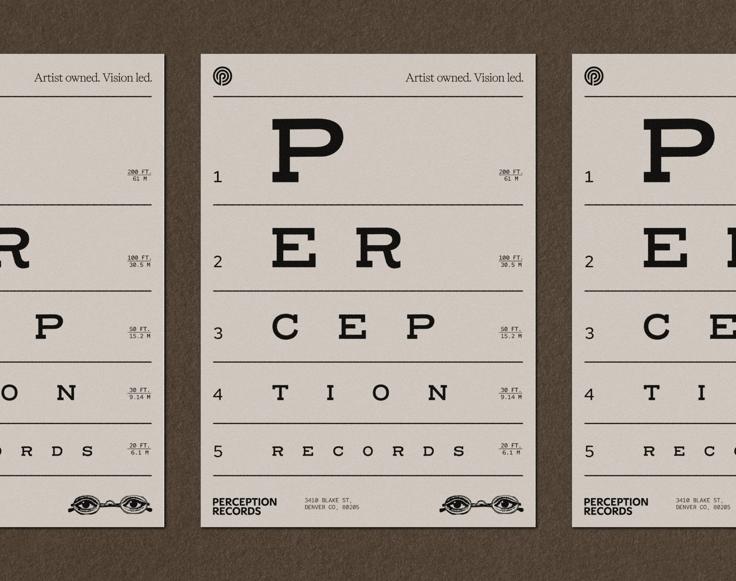
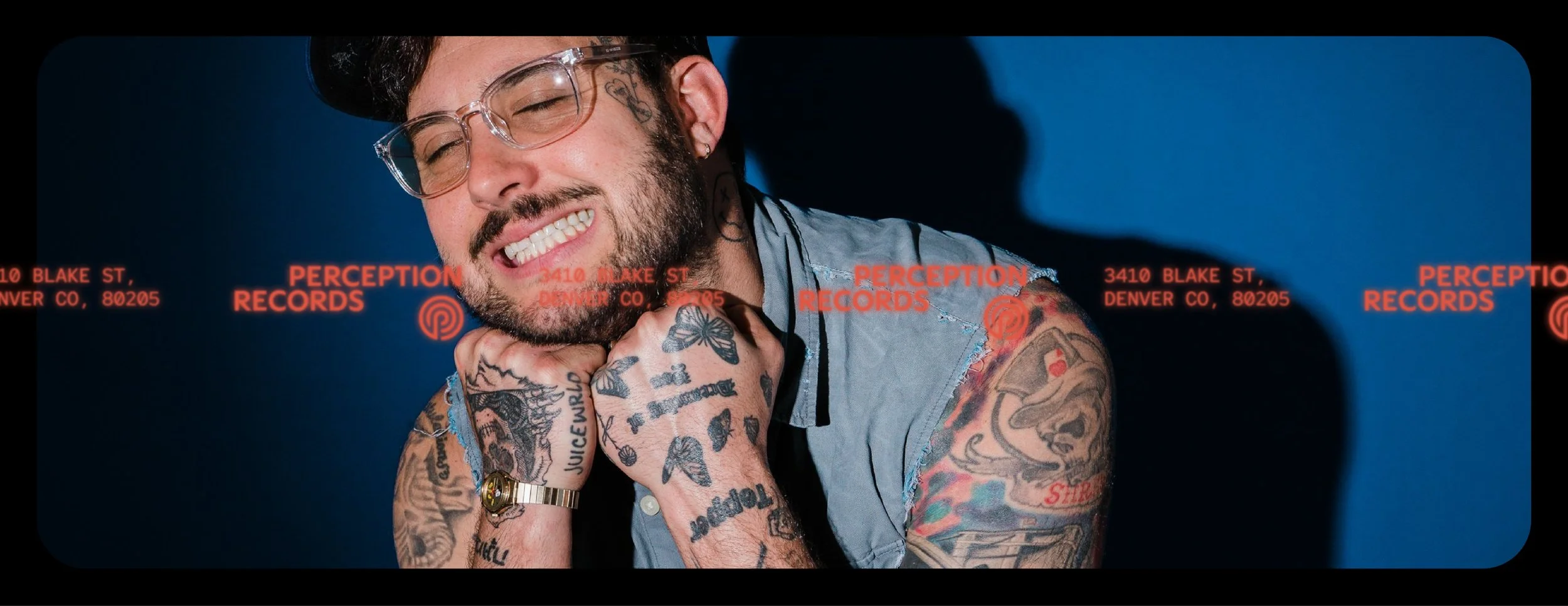
As the name suggests, Perception is all about vision and independence. I must admit this made me go a little off script as I spent waaaaay too long creating a branded eye test chart but these values led me to think about other things that are inherently individual. Polaroids. Indie cinema. Live music. Things that can’t be replicated.
These references informed the wider visual language. Layouts drew inspiration from vintage film strips, introducing rhythm and imperfection into branded assets. Imagery selection leaned towards moments that felt lived-in and fleeting, capturing emotion and human presence rather than polish. Together, these elements helped the brand feel authentic, grounded, and human.
The resulting identity feels like a natural progression for Perception Records. One that respects where the label came from while giving it the space and flexibility to grow.
Allowing the wider identity system to be shaped by authentic, human experiences that value individuality and imperfection.
Like what you see? Thinking about working together?
Drop me a line here. I’m always up for a chat - especially with people who are passionate about what they do.
If you’d like to see the video process of building the Perception Records brand, check it out here.