
Please note: this case study is in the process of being updated
·
Please note: this case study is in the process of being updated ·
Sylvarna Kitchen Design
Service (s)
Bespoke Identity Design
Year
2023
With over 40 years of experience in delivering bespoke kitchen design, Sylvarna have built an irrefutable reputation for designing and installing the finest quality kitchens tailor made to each customer. However, nearly half a decade can date any brand’s identity and leave them feeling stuck in the past. This is where I came in! I needed to elevate Sylvarna’s identity - bringing them into the modern day by building upon their legacy and giving them an identity that garners trust and reliability.


The concept
When looking at their current logo design, it left me feeling a little uninspired and I couldn’t glean any meaning from the mark. I wanted to change that. The name Sylvarna is affectionally formed from Nick’s Grandma’s name, Sylvia. During my research phase, I was interested in the etymology of the name and I was excited to learn it derived from Latin to mean ‘forest’ or ‘spirit of the wood’. This got me buzzed with ideas as not only is wood present in the brand name but it’s also a material widely used in kitchen design. Frustratingly though, trees are one of the most commonly used brand icons so I needed to find a unique way to express this idea.
I came up with a bunch of ideas; initially trying to combine an S and a K to form the branches. However, this looked as though the tree had lived through a rather tough winter, losing all it’s leaves and feeling a little sorry for itself. Furthermore, due to the nature of the S letterform, it mean that the design was unbalanced. Something important to Nick.
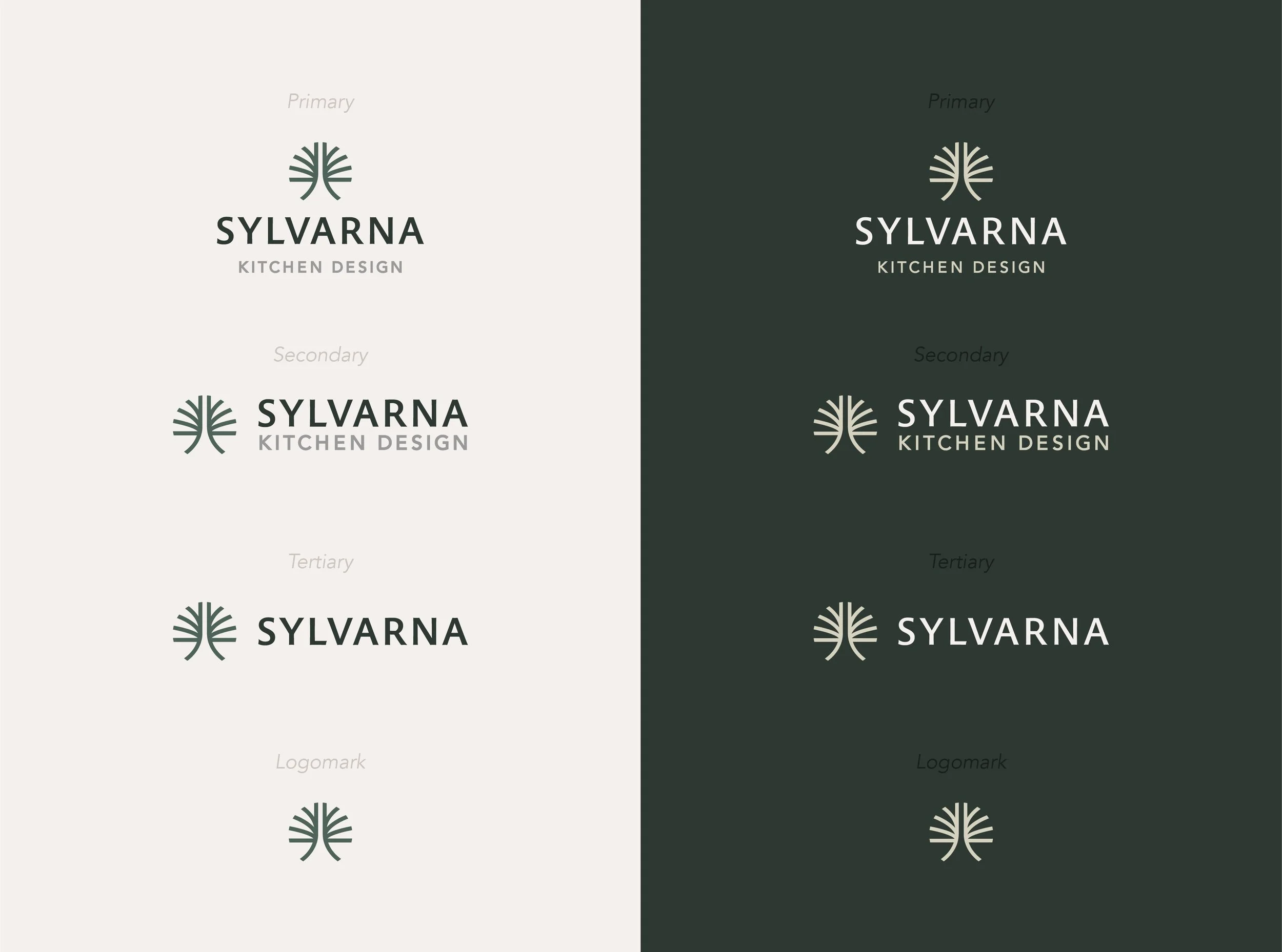
So, back to the drawing board I went and I stumbled across a sweet idea creating a tree from various oval shapes encapsulated in a circle. It was fresh, unique, and elegant. Immediately I was punching the air in that World Cup Final 90th minute winner way. I leaped straight onto the computer to digitise this bad boy and after many, many, many tweaks (who knew geometry could be this hard to perfect?), I cracked it.

Type & colour
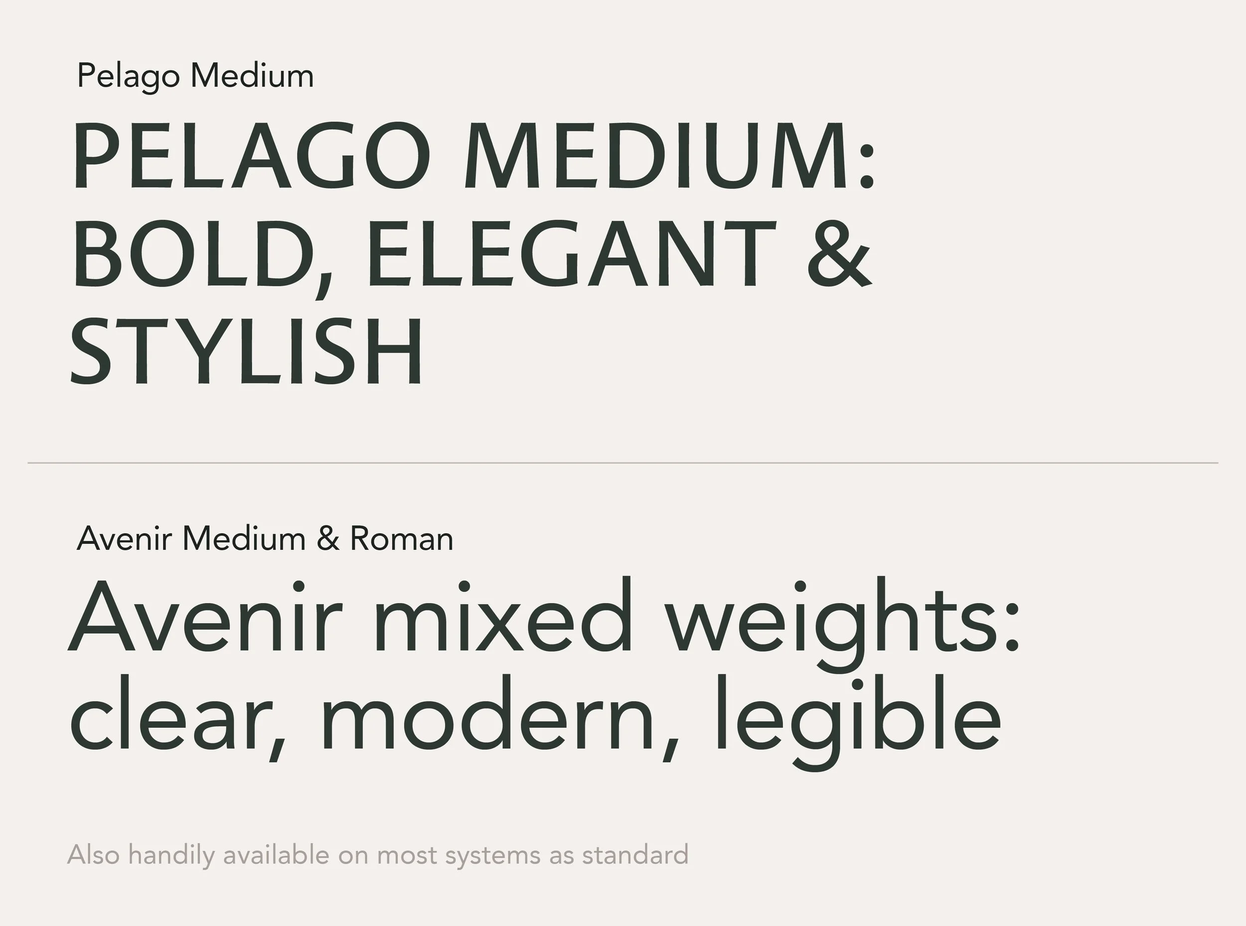
When pairing the mark with a typeface, I knew I wanted to land somewhere in, what I call, the semi-serif space. Which, if you’re not immediately on board with my description, is a typeface that takes elements from both serifs and sans-serifs to create a luxe but modern style. For example, taking the thicks and thins ratio from a serif typeface and lopping off the serifs. This would be perfect for Sylvarna - allowing the identity to nod to heritage whilst keeping a firm eye on the future. To compliment Pelago, I chose Avenir. With its clean lines and balanced proportions, it ensures optimal readability whilst reflecting Sylvarna’s commitment to clarity and professionalism. A bonus point for Avenir is that it’s available on most systems as standard so there shouldn’t be any issues viewing documents from machine to machine.
Tying the identity together is the colour palette. Being rooted in earthy tones, it harks back to the crux of the identity (wood/forest) whilst having a foot firmly planted in today and the future. Rich greens complimented with calming off whites ensured we didn’t lose touch with the high end and sophisticated nature of the brand.


Finalising
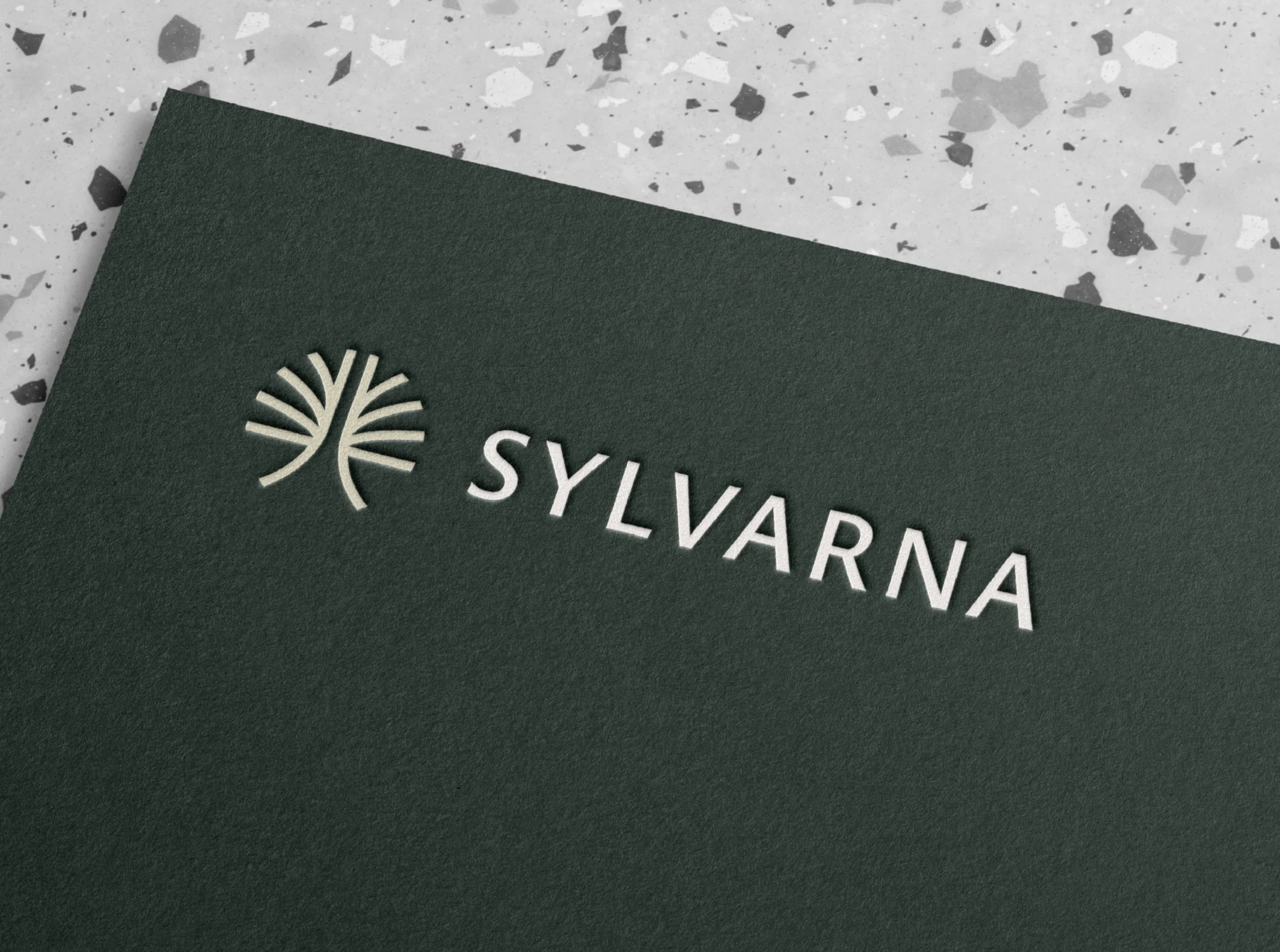
Once we nailed the identity, Nick asked for a couple of pieces of branded collateral so I pulled together their business card, letterhead and email signature design. After wrapping up this part of the project, I created van decals, roundabout billboards, merchandise, the lot!
I’m so thrilled with how this identity turned out so I’ll be visiting the show room as soon as all the signage is up to take some pics for this case study so stay tuned!


Testimonial
“Choosing a designer has always been difficult to me. You have to put a lot of trust in their vision based on their previous work, but can't be truly sure about the chances for success for your specific business. From our first chat, it was clear that we were in safe hands with Jack. He took the time to understand us as a company and everything we are and gave his ideas time to grow into a considered proposal. The way he presented his designs to us made clear the journey he went through and the depth of thought that had gone into it. We are so happy with the end product and have to say that Jack is easily the best designer we've had the pleasure to work with and a lovely guy too.”