
USU
SERVICES:NAMING & BRAND IDENTITYINDUSTRY:COMBAT/GENERAL SPORTSYEAR:2024USU (formerly Asgard503) was born from over a decade of dedication to Jiu Jitsu. Founded in 2016 by Mike & Liv who know the sport inside and out, the brand has grown from a community-driven idea into something with real ambition: superior quality sportswear, with designs that inspire passionate people.
The brand operates on two fronts - a growing line of own-brand gear and a custom design service built around one-to-one relationships with gym owners and athletes. But USU had their sights set on building something bigger. With a vision to become a leader not just in combat sports but across athletic pursuits more broadly, the brand needed an identity to reflect that scale of thinking.
The existing identity, built around Norse mythology and the Asgard503 name, had served its purpose but no longer reflected who they were becoming. The new identity needed to carry a wide range of apparel themes while staying instantly recognisable - flexible enough to grow with the brand, and grounded enough to honour the community that built it.
Crafting a brand name rooted in their purpose whilst conceptual enough to build meaningful brand association over time.
Although Mike & Liv had earned a good amount of brand equity with the name Asgard503, it had two main problems. Firstly, it was often mispronounced as Ass-gard503 which although quite accurately describes their product purpose, it’s not the best connotation for where the brand is headed. And secondly, despite heaps of meaning in the numerical suffix (their area code), makes the name read like a childhood email address.
Through my strategy sessions with Mike & Liv, we unearthed a bunch of great avenues to explore further for the brand name. We understood their role in the lives of their audiences, their brand story and dialled in their personality and tone. Through this work, we found that the concept of movement and progress felt most aligned to the brand. To ensure strong own-ability, I took inspiration from other languages, smashed words together, and completely fabricated some, until we landed on USU which translates to practise from Latin. Instant winner.
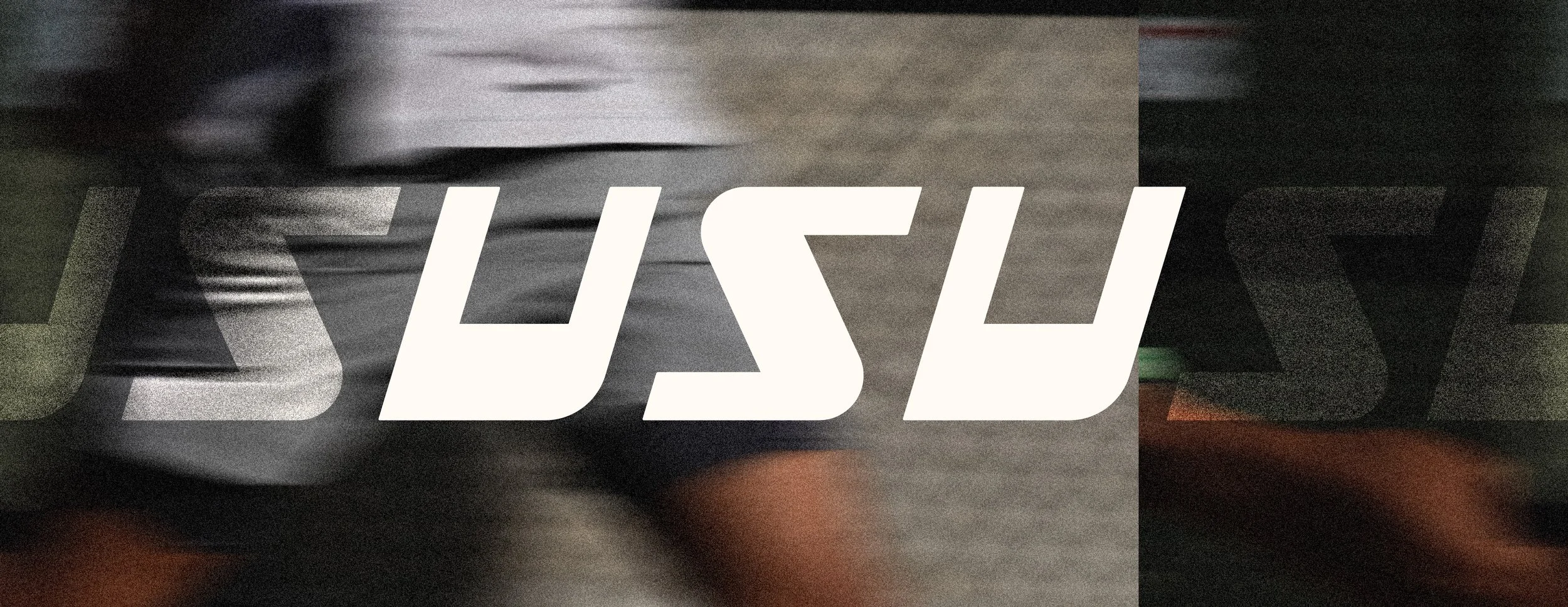
With the brand name decided, and creative direction agreed, I tackled the logo. During the exercises in the strategy workshop, Mike & Liv gravitated to feelings of stoicism, quiet confidence and utility. Communicating the essence of the brand as simply as possible and with a three-letter brand name, lent perfectly to a custom wordmark but I needed to be mindful not to tread on the toes of the UFC.
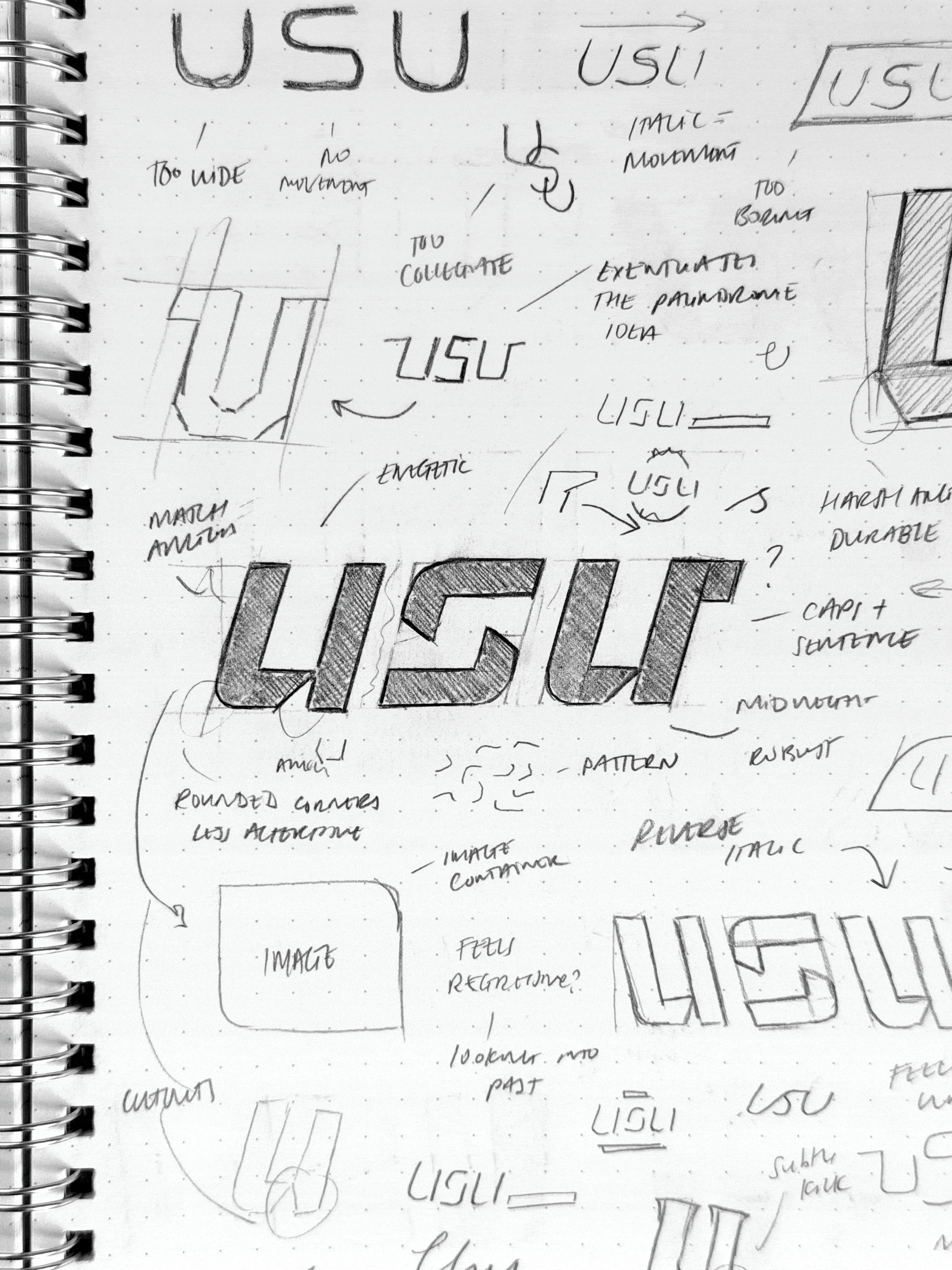
The challenge with designing for simplicity is stripping enough back without losing the personality and story of the brand.
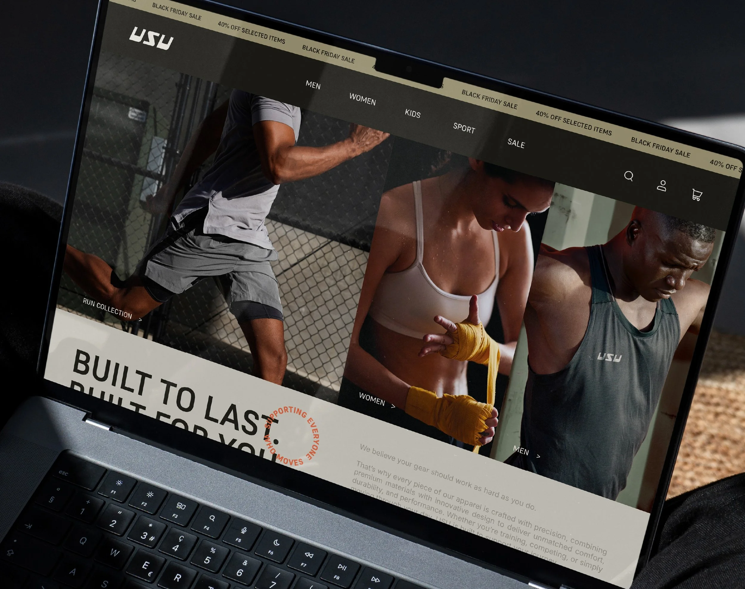
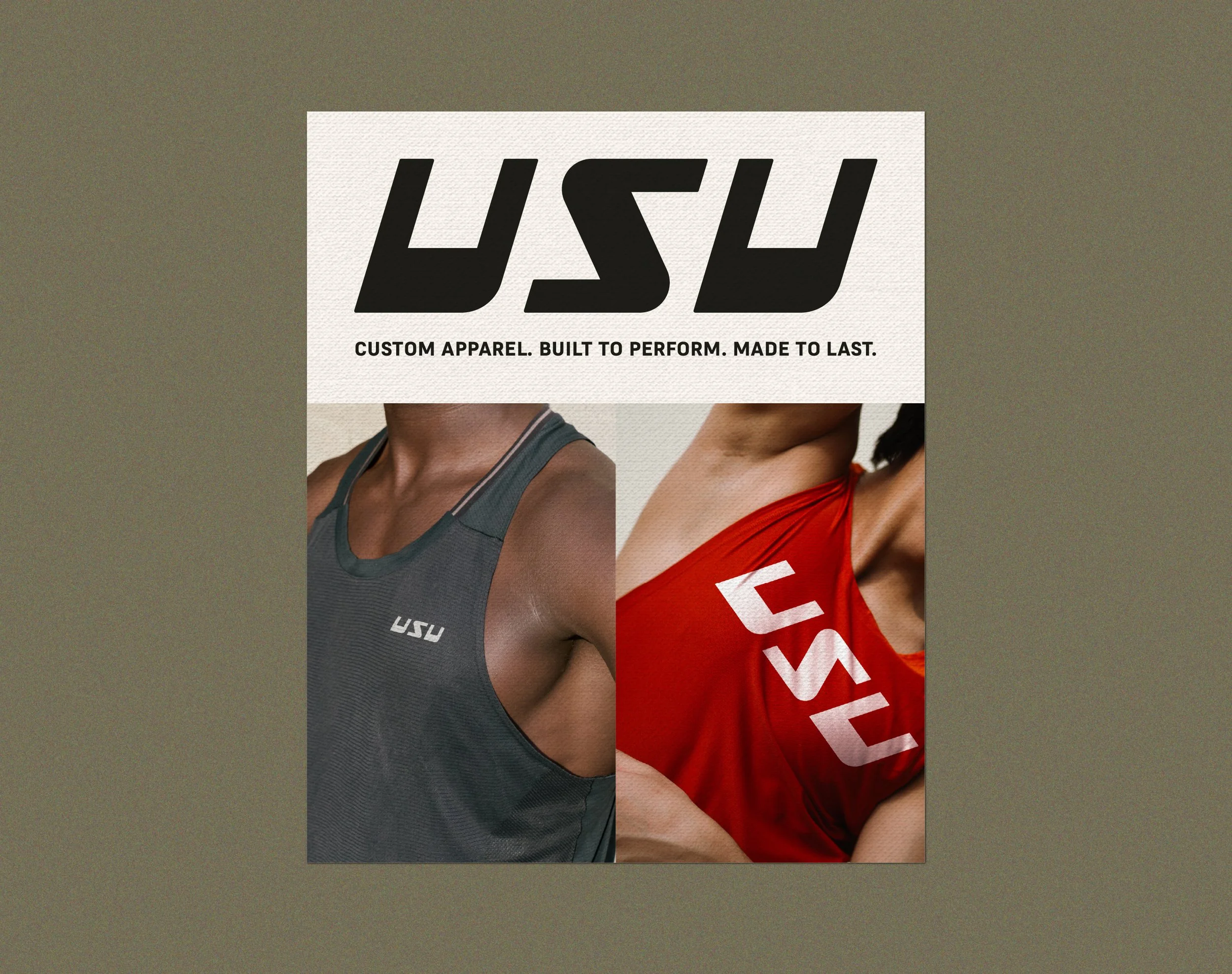
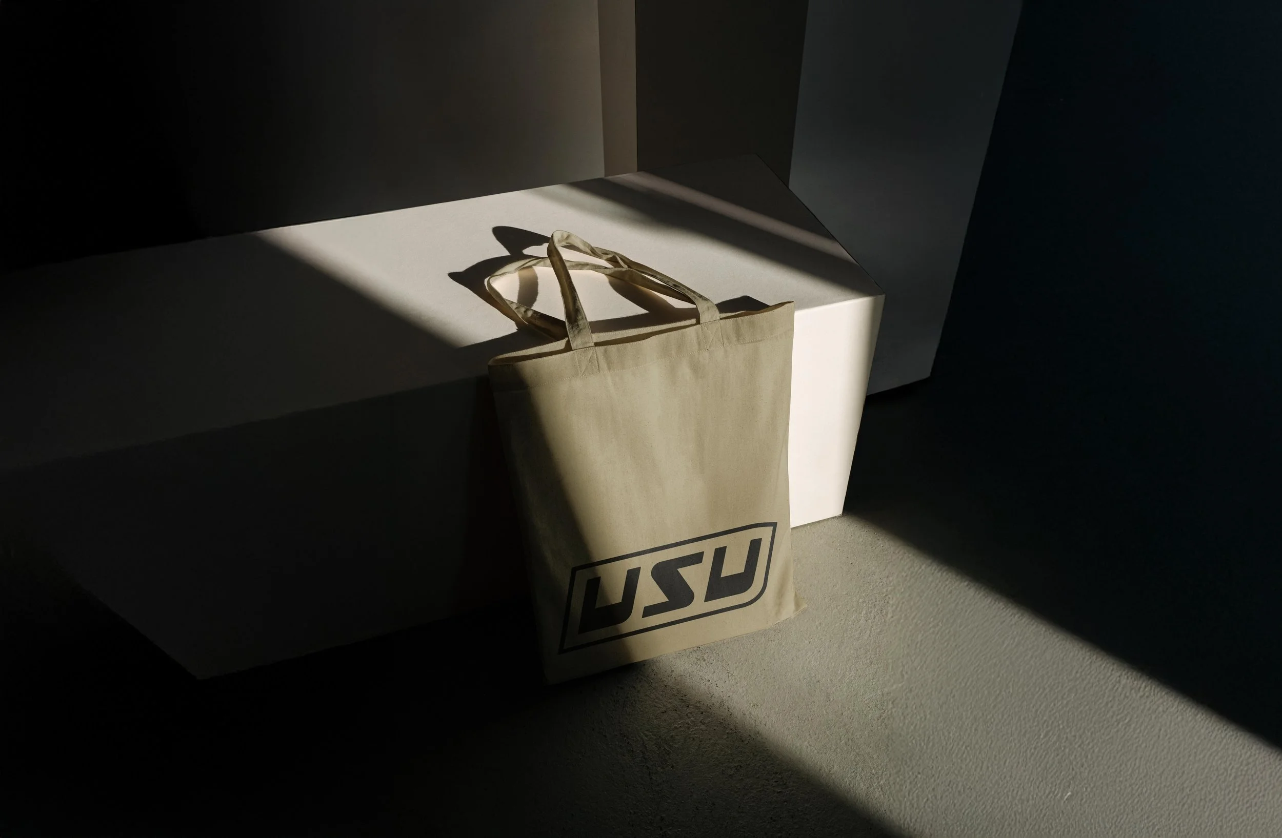
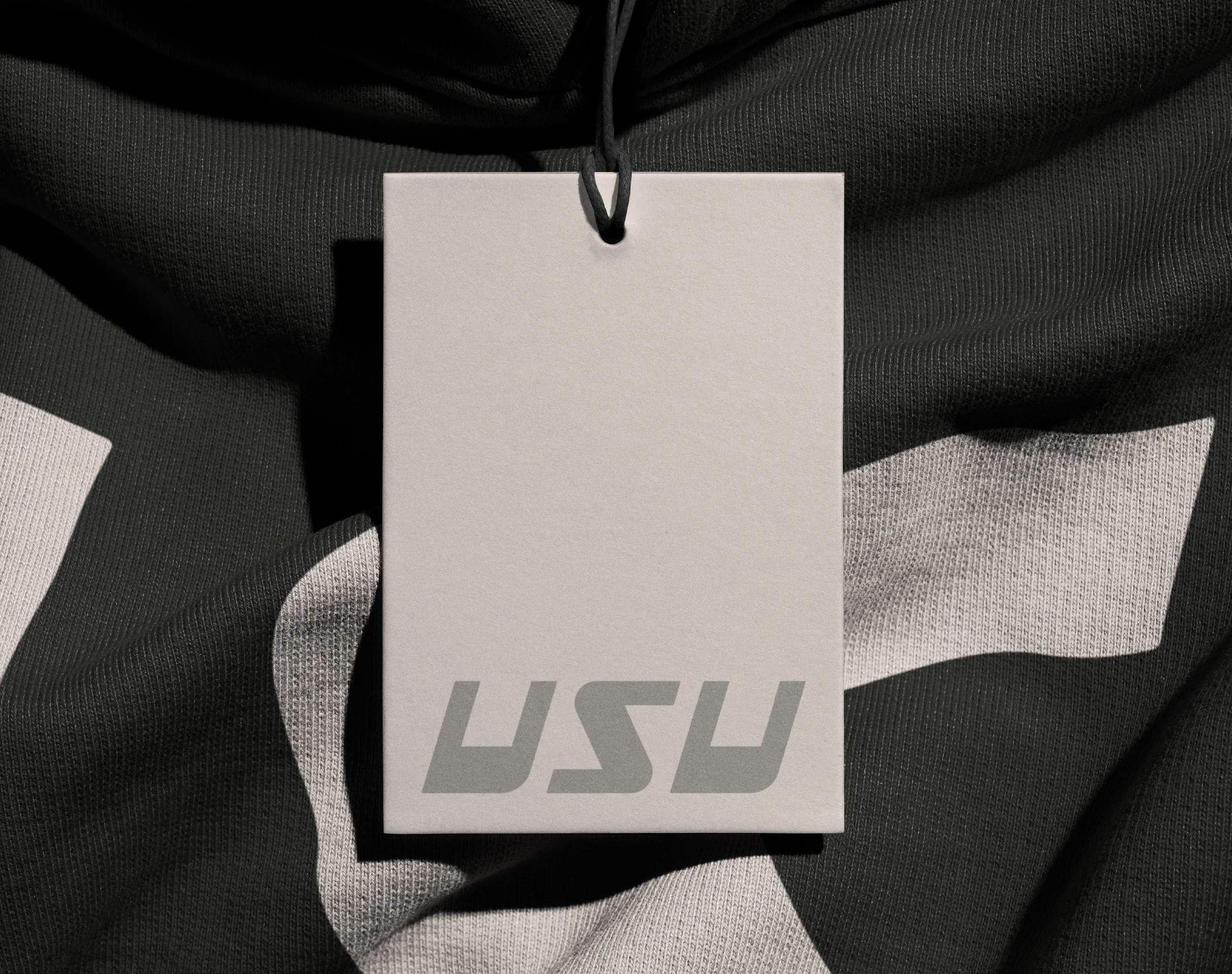
The area code was such a glaring feature of USU’s former name, and a meaningful one too, so I wanted to honour that in the new logo in some way. The idea of movement was a massive topic in conversations with Mike & Liv which can be communicated subtly through italicised letters but how aggressive or subtle should the angle be? This is where I saw opportunity to bake in the DNA of the Asgard503. By interpreting 503 as an angle (50.3°) and using that as the severity of the shear… the logo looks mad and hardly legible. So, if we take 50.3° and divide it by the number of letters, we get a much more reasonable level of italicisation. Combining this concept with clean straight lines, soft rounded terminals and quirky letterform design, I created a hyper-simple wordmark packed with enough personality and story to be remembered.
Colour has the power to set a tone, encourage behaviour and prime an audience for what they should feel so it shouldn’t be an afterthought.
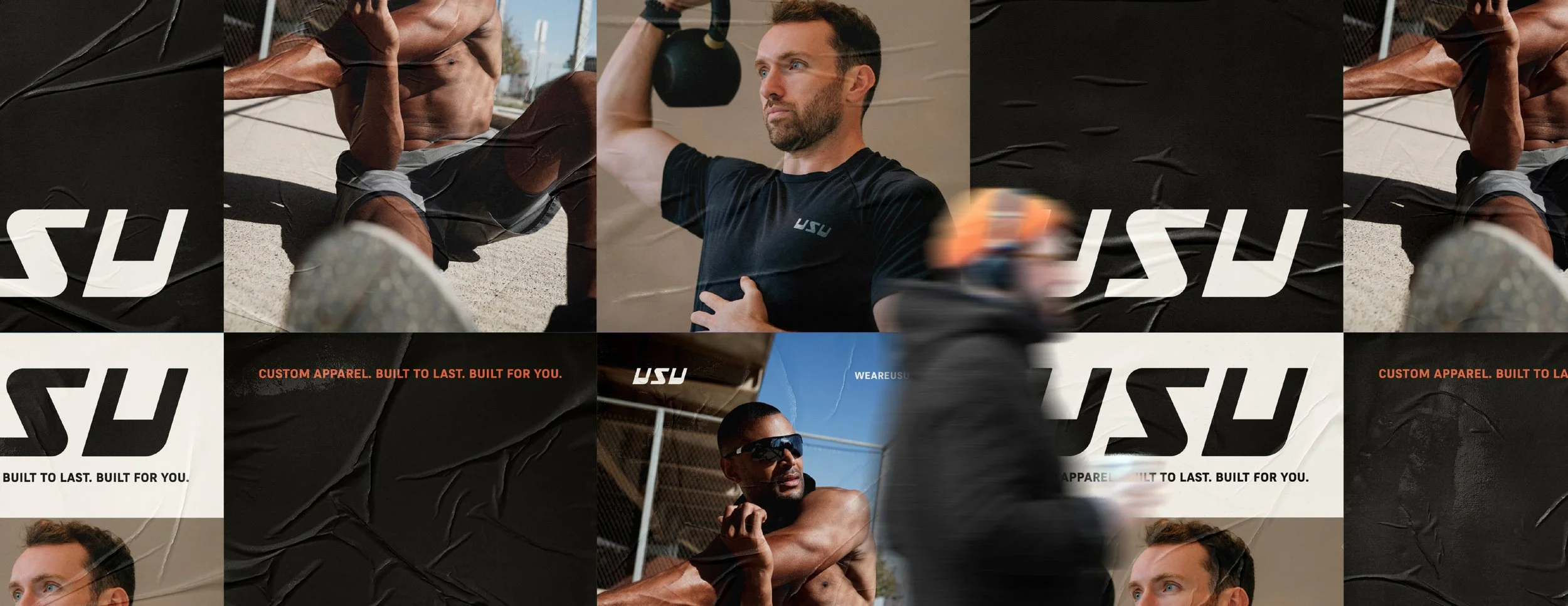
Linking back to USU’s utilitarian ethos and stoic personality, the colour palette was never going to be garish - especially not to clash against the custom designed pieces for their clients. Leading with neutral hues created a grounded foundation and a pop of coral orange spoke to the energy and movement of the brand.
Although there are a limited number of combinations, the ability to chop and change them is what makes the palette so easy to use and apply. Not only does this make Mike & Liv’s lives easier, but it builds brand recognition quicker than a 20-30 hue colour palette ever could.
Aligning to the hard-wearing nature of the wordmark logo and USU’s mission of ubiquity, the typography choices were vital.
Supreme in various weights supported by Inter further communicated the essence of USU. The durable and utilitarian nature of Supreme pairs perfectly with the hyper-legible Swiss aesthetic of Inter, creating a family of typography that is easy to apply and scale as the business grows. Together, they give USU the range to move between bold, characterful headings and clean, functional body copy without ever losing the consistency the brand needs to grow into something iconic.
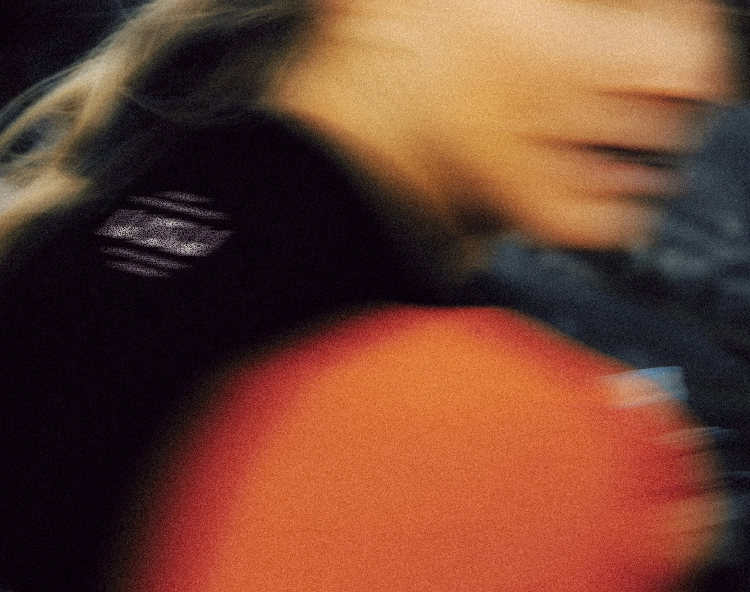
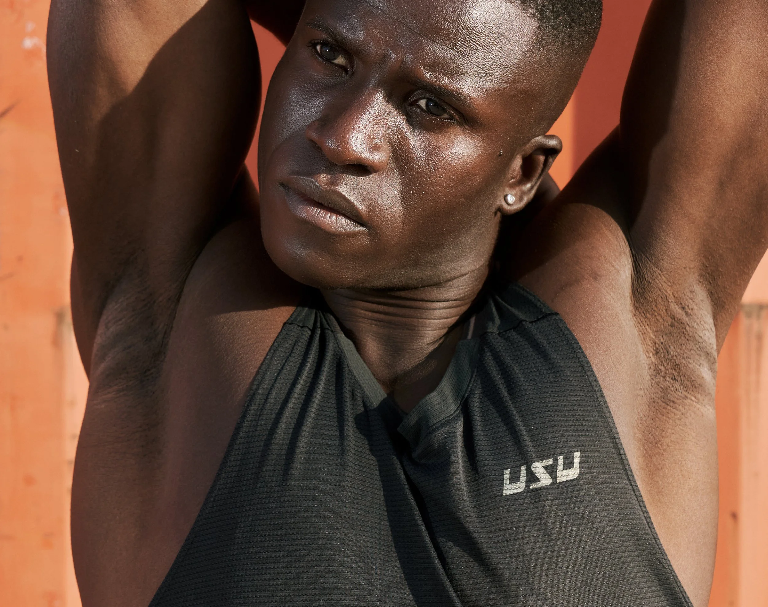
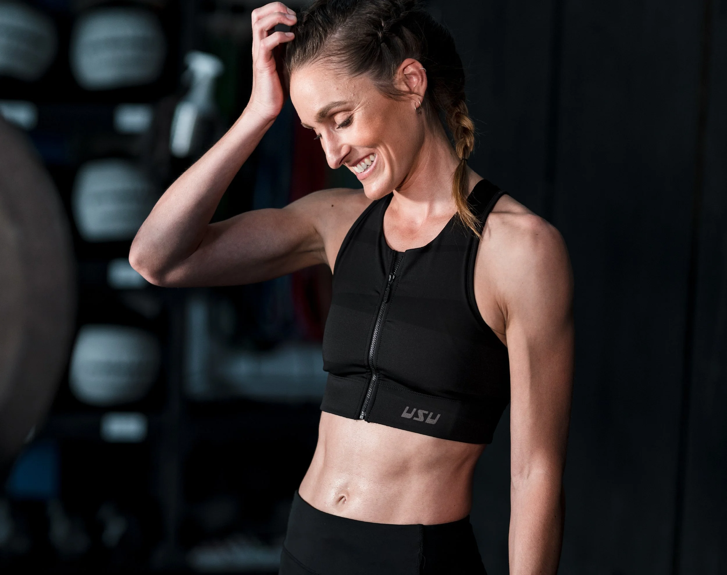
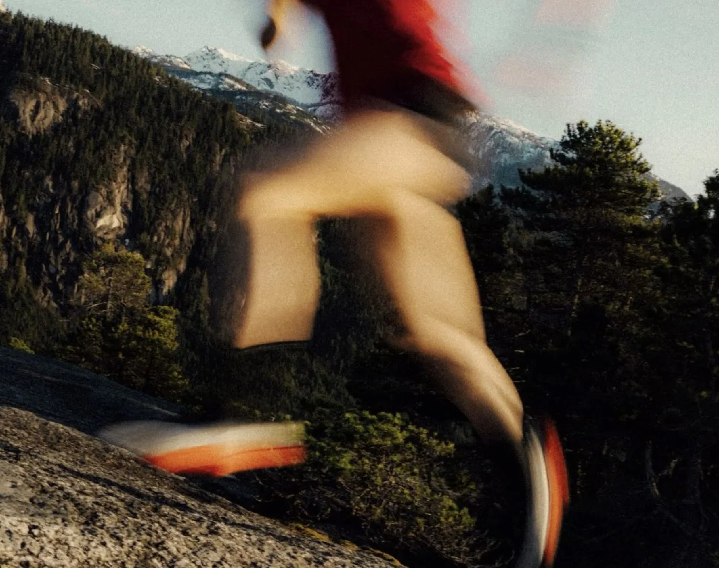
Leaning on high energy, kinetic photography to build an immediate connection to sport and movement.
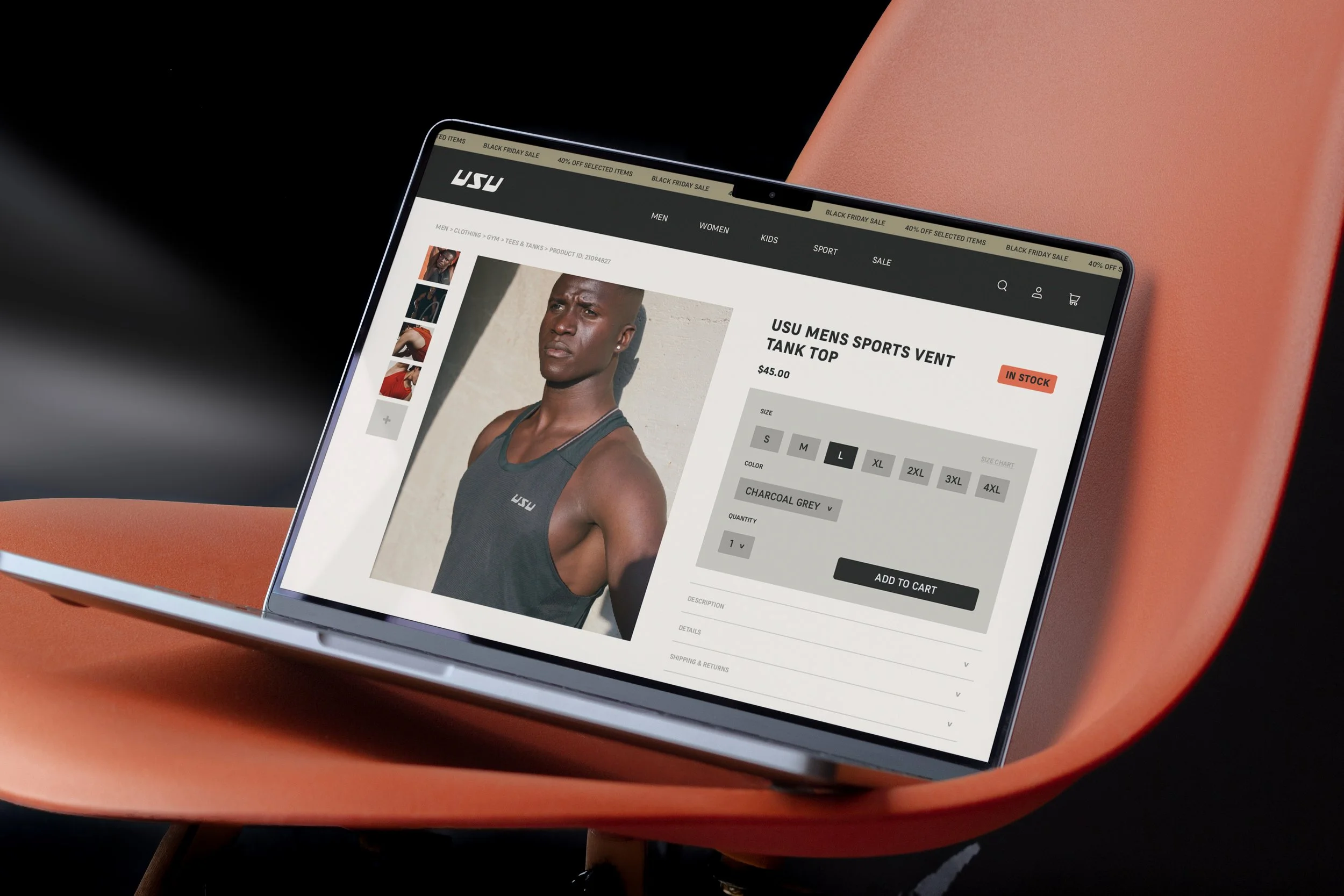
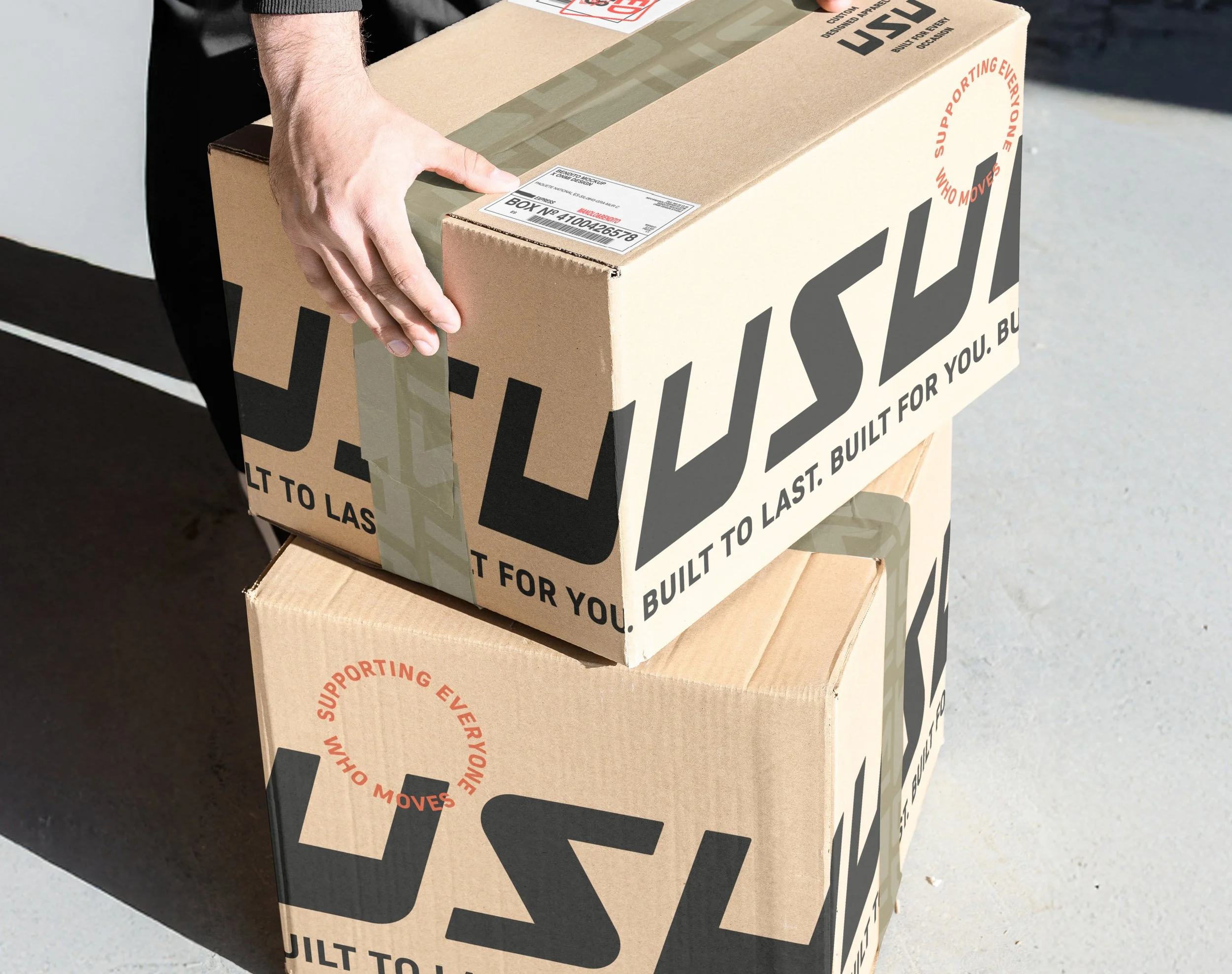
Photography is such a powerful tool to communicate brand values, personality and story. USU's is no different. The photography style splits across two modes: product and editorial. Product shots are clean and direct, putting the gear front and centre with enough context to communicate quality. Editorial leans into motion and energy - bodies mid-movement, intentionally blurred, evoking the physicality of sport. Together, the two styles give USU the flexibility to show up differently across contexts while always feeling unmistakably like the same brand.
Like what you see? Thinking about working together?
Drop me a line here. I’m always up for a chat - especially with people who are passionate about what they do.
“Jack has breathed life back into our brand with the work he has done for our company's rebrand and new logo. He came highly recommended by a work colleague, and the key piece of advice that we were given at the start was "trust Jack and the process". This was the understatement of the century because what Jack delivered in the end was nothing short of amazing! He truly understands what it takes to deliver a finished brand that represents a company but that is just the tip of the iceberg for what he delivers. He gave us a vision of the future and a goal to live up to with all of the work he did for us.”
Mike & Liv
Founders, USU