WEIMA
Year
2026
Industry
Sustainability
Services
Logo Design
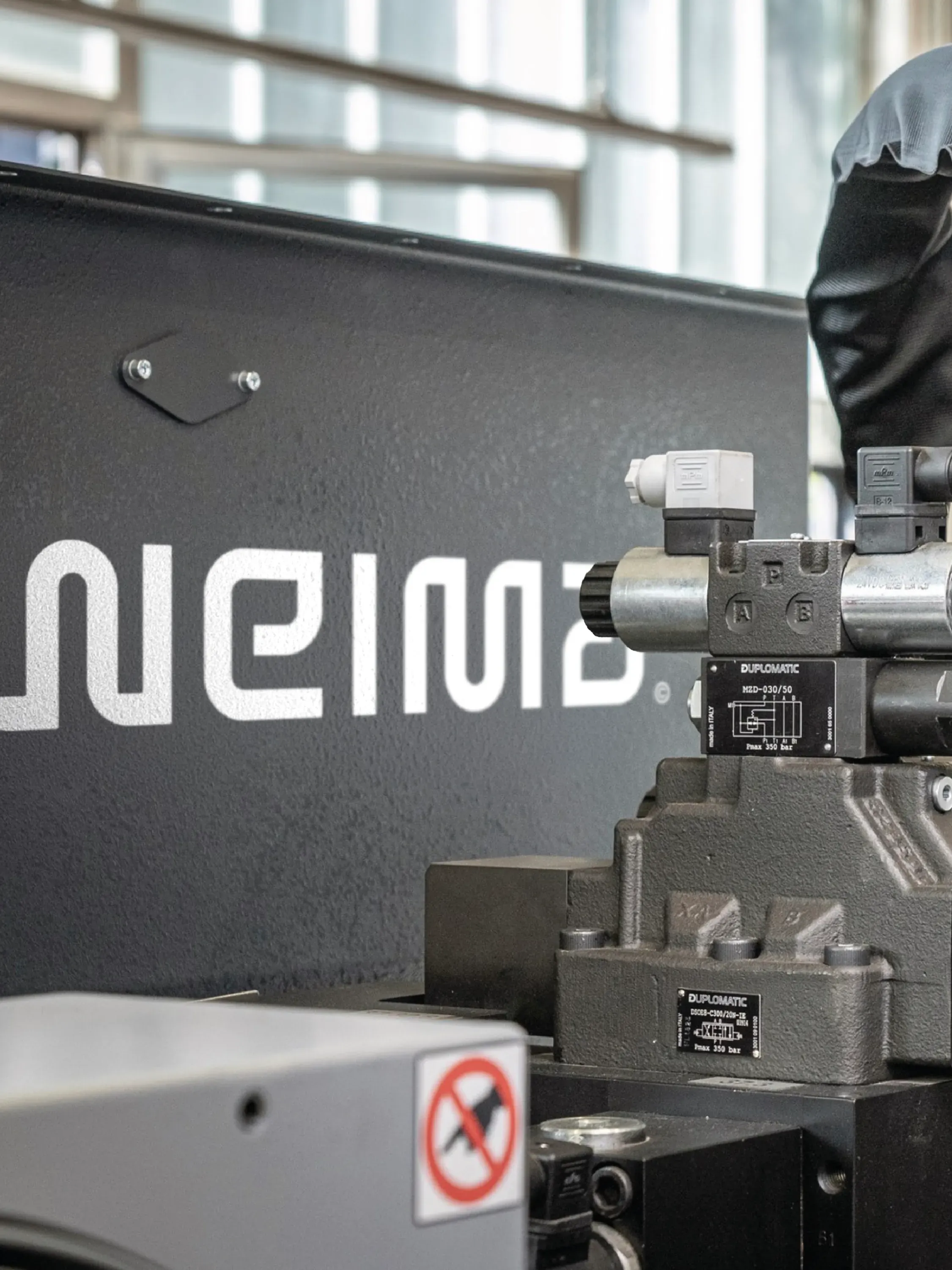
For over 45 years, WEIMA has engineered the world's best industrial recycling machines — shredding, compacting and dewatering all the materials the world can't afford to waste.

[01]
The Client
Nearly half a century in the making
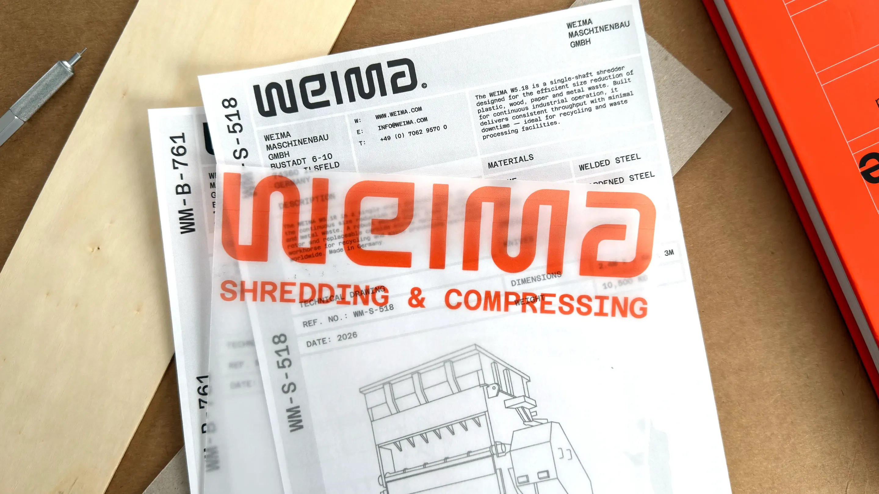
WEIMA was founded in 1980 by Peter Rössler - a visionary entrepreneur who developed one of the first industrial wood shredders for carpentry workshops. What started as a one-off machine has since grown into a global operation with production facilities across Germany, US, China, Korea, India and Brazil. They produce over 1,000 machines every year and have sold more than 40,000 (!!!) since founding.
Despite all of that, WEIMA’s brand hadn’t kept pace with their growth. So, ahead of their 50th anniversary, it was time to revisit the brand that will take them into their next chapter.
WEIMA was founded in 1980 by Peter Rössler - a visionary entrepreneur who developed one of the first industrial wood shredders for carpentry workshops. What started as a one-off machine has since grown into a global operation with production facilities across Germany, US, China, Korea, India and Brazil. They produce over 1,000 machines every year and have sold more than 40,000 (!!!) since founding.
Despite all of that, WEIMA’s brand hadn’t kept pace with their growth. So, ahead of their 50th anniversary, it was time to revisit the brand that will take them into their next chapter.

[02]
The Challenge
A simple yet challenging task
I was brought in with a very focused brief: the new visual identity was already designed, but the wordmark needed rethinking from the ground up. It was an interesting challenge - designing something new that slots into a new identity built around the old logo… how hard could it be???
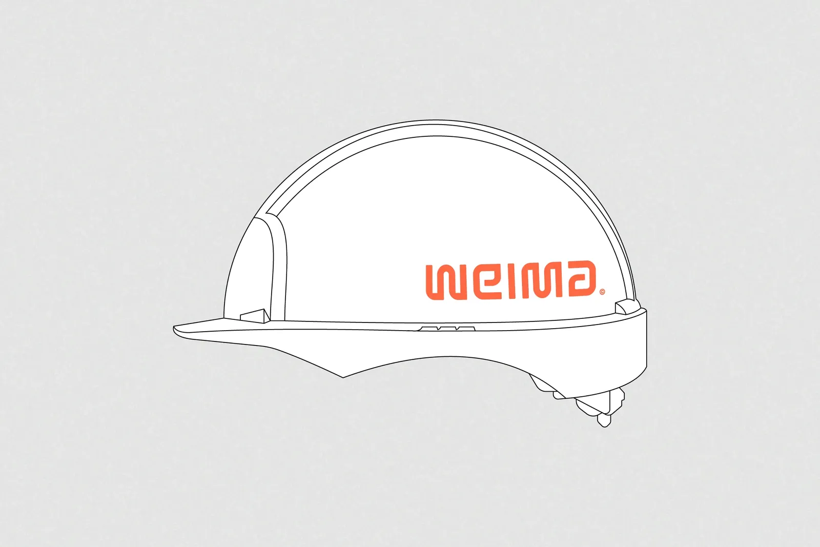
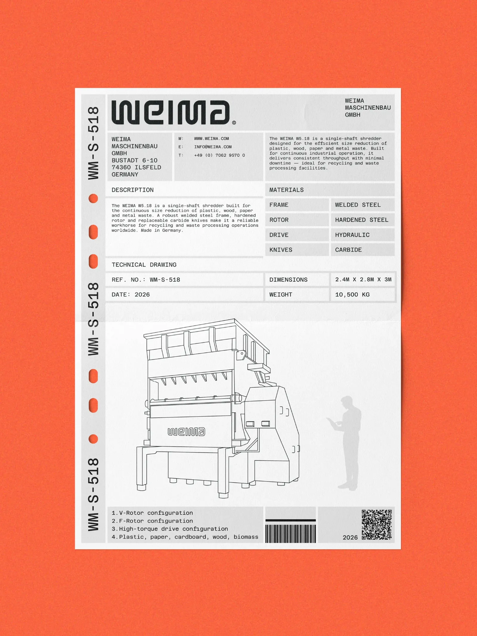
I think this is a good spot for a little disclaimer. The applications you’ll see throughout this case study are my own explorations of how the mark could live in a brand ecosystem. At the time, the new identity was still being finalised so I presented the work with my own vision of the wider brand. They’re not representative of WEIMA’s new full brand system, as that wasn’t my job, but they show how the work translates through different brand executions.
I was brought in with a very focused brief: the new visual identity was already designed, but the wordmark needed rethinking from the ground up. It was an interesting challenge - designing something new that slots into a new identity built around the old logo… how hard could it be???
I think this is a good spot for a little disclaimer. The applications you’ll see throughout this case study are my own explorations of how the mark could live in a brand ecosystem. At the time, the new identity was still being finalised so I presented the work with my own vision of the wider brand. They’re not representative of WEIMA’s new full brand system, as that wasn’t my job, but they show how the work translates through different brand executions.

[03]
The Concept
No trees. No leaves. No nature.
Central to the brief was to ignore any reference to cliché sustainability cues. This meant running as far away as possible from trees, leaves, branches, grass… anything that trivialises or dumbs down the importance of WEIMA’s work.
It’s a pretty standard technique: that when staring at a blank page of ideas, to start writing the brand name over and over again in different styles. Fortunately, the first time I wrote out the name, I noticed that if you draw the letters in a certain way, you can reuse — recycle, even — the W as the M and the E as the A. This idea of subtle recycling became the conceptual backbone of the entire project.
Central to the brief was to ignore any reference to cliché sustainability cues. This meant running as far away as possible from trees, leaves, branches, grass… anything that trivialises or dumbs down the importance of WEIMA’s work.
It’s a pretty standard technique: that when staring at a blank page of ideas, to start writing the brand name over and over again in different styles. Fortunately, the first time I wrote out the name, I noticed that if you draw the letters in a certain way, you can reuse — recycle, even — the W as the M and the E as the A. This idea of subtle recycling became the conceptual backbone of the entire project.


[04]
The Craft
Engineered and human in equal measure
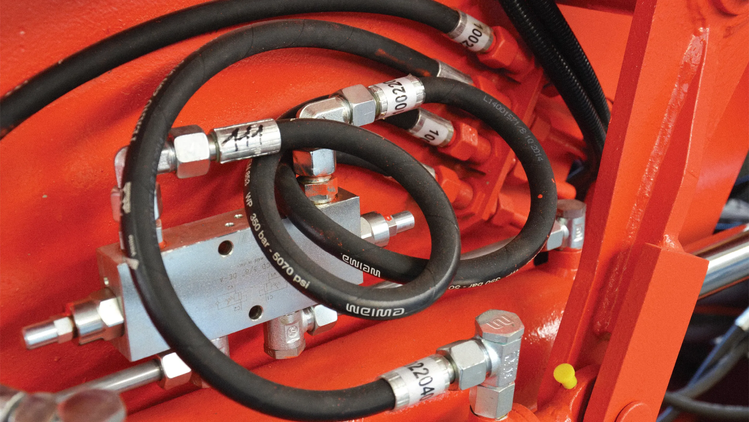
The wordmark needed to carry the concept without overselling it. Industrial enough to sit on a machine but refined enough to align with WEIMA’s position as market leader. I drew each letter from scratch to find the right balance between rounded corners and straight lines. Too round and it softens the wordmark into something friendly but forgettable. Too angular and it tips into cold, generic engineering territory. The sweet spot is what we were after: an execution that feels engineered and human in equal measure.
The wordmark needed to carry the concept without overselling it. Industrial enough to sit on a machine but refined enough to align with WEIMA’s position as market leader. I drew each letter from scratch to find the right balance between rounded corners and straight lines. Too round and it softens the wordmark into something friendly but forgettable. Too angular and it tips into cold, generic engineering territory. The sweet spot is what we were after: an execution that feels engineered and human in equal measure.

[05]
The System
Built for the real world
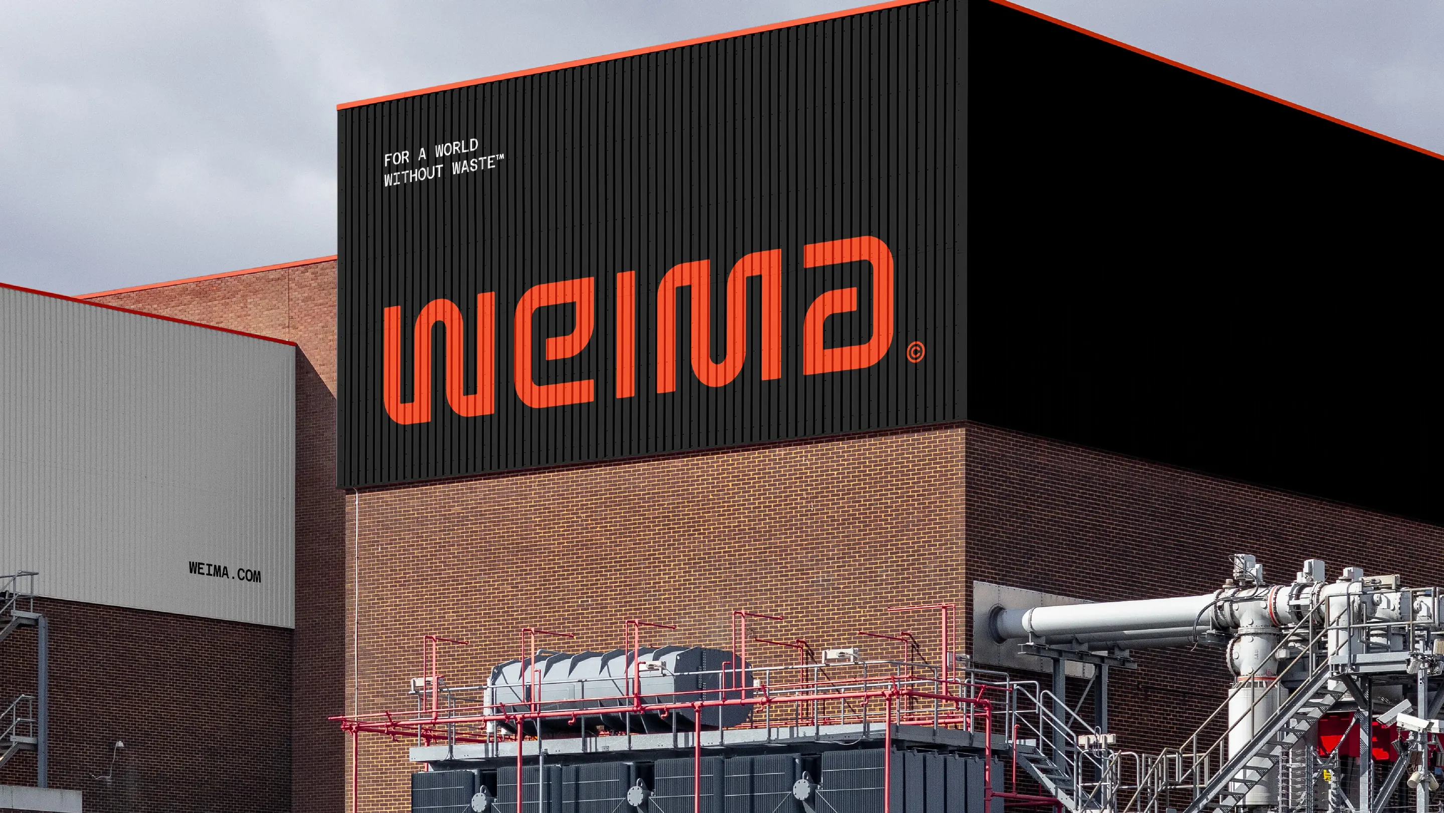
Industrial branding lives or dies on its ability to perform in production. Every decision was filtered through that reality - how does this sit pressed into metal? How does it read at 5mm on a machine badge? Does it hold up on signage at the side of a factory?
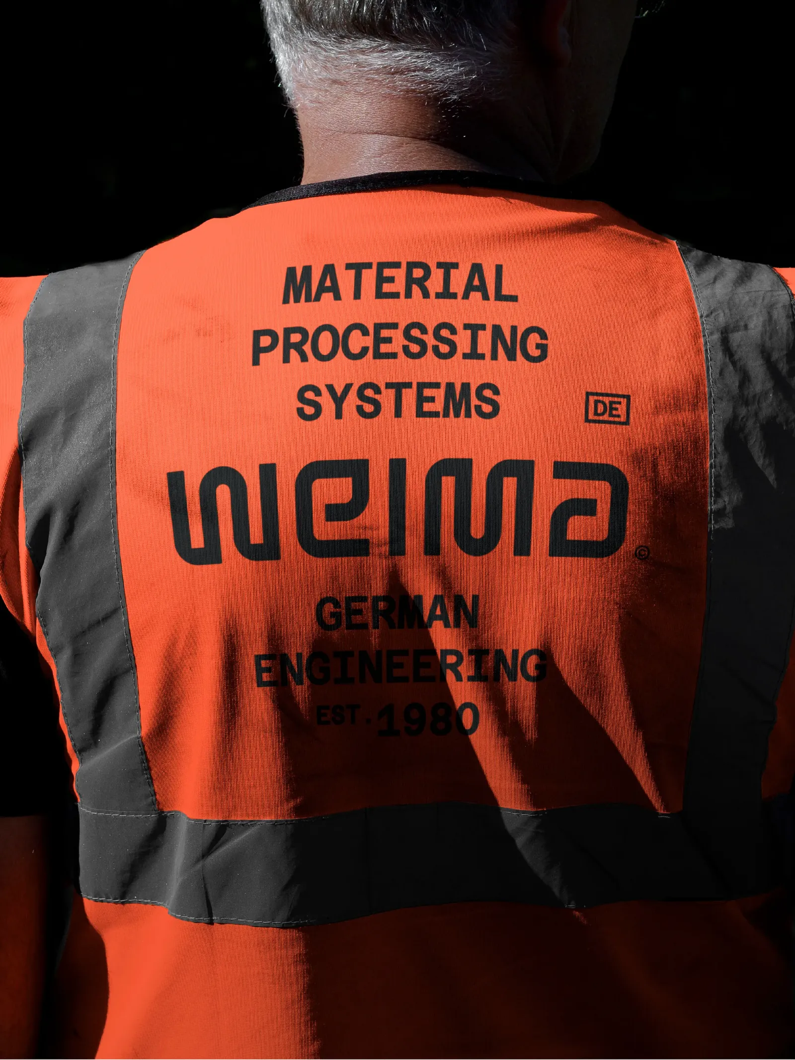
The wordmark needed to work across a full system: a standalone mark for tight spaces, tagged versions for contexts where the business needed more introduction, and a badge format for larger, brand-led applications. Each lockup was designed with the same engineering logic as the wordmark itself - nothing decorative, nothing that couldn't be reproduced cleanly in the real world.
Industrial branding lives or dies on its ability to perform in production. Every decision was filtered through that reality - how does this sit pressed into metal? How does it read at 5mm on a machine badge? Does it hold up on signage at the side of a factory?
The wordmark needed to work across a full system: a standalone mark for tight spaces, tagged versions for contexts where the business needed more introduction, and a badge format for larger, brand-led applications. Each lockup was designed with the same engineering logic as the wordmark itself - nothing decorative, nothing that couldn't be reproduced cleanly in the real world.


[06]
The Mission
For a world without waste
WEIMA's entire purpose is transformation - taking what the world throws away and turning it into something useful again. ‘For a world without waste’ is such a clear articulation of that. It doesn’t feel like a marketing line, it feels like a proper mission.
Everything about this identity is in service of that idea. An engineered wordmark that embodies transformation. A system built for real-world production. A brand that finally looks like the company behind it.
WEIMA's entire purpose is transformation - taking what the world throws away and turning it into something useful again. ‘For a world without waste’ is such a clear articulation of that. It doesn’t feel like a marketing line, it feels like a proper mission.
Everything about this identity is in service of that idea. An engineered wordmark that embodies transformation. A system built for real-world production. A brand that finally looks like the company behind it.
“We were in regular contact and consultations with Jack, so we always felt confident throughout the process. He fully met our expectations, and we would definitely recommend him.”
“We were in regular contact and consultations with Jack, so we always felt confident throughout the process. He fully met our expectations, and we would definitely recommend him.”
“We were in regular contact and consultations with Jack, so we always felt confident throughout the process. He fully met our expectations, and we would definitely recommend him.”
WEIMA
WEIMA
WEIMA
Pascal Erler
Pascal Erler
Marketing Manager
Marketing Manager
Keep exploring


ready when you areStart a project→
ready when you areStart a project→
ready when you areStart a project→